BUILDING FOR CHILDREN is not easy. Their energy explodes all the boundaries, since they are not yet familiar with the diktat of adult life that you have to spend most of your day sitting still. It is therefore a tough challenge to create architecture for children, something that makes architects self-critically question regular architecture.
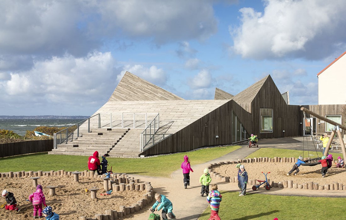
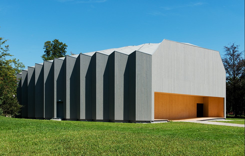
Råå Preschool in Helsingborg, right by the waters of Öresund, looks more like a sculpture than a kindergarten. The school has an unbroken geometric shape with a facade of narrow vertical robinia cladding. Not exactly what you might expect alongside the traditional brick facades of the old school buildings. The interior is at least as fascinating with all its angles and nooks, large windows and triangular lanterns that illuminate the open environment. In an uninsulated side building, the little ones can sleep off their lunch in little wooden wagons, indoors and yet outdoors.
“The key is to encourage the children’s motor skills with spaces where they can climb and negotiate steps,” says Pernille Svendsen, architect at Danish practice Dorte Mandrup, which is responsible for this project.
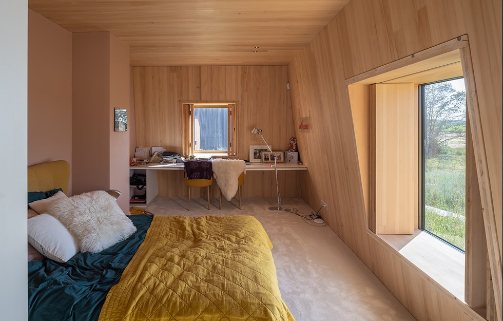
“Wood is a fantastic material that brings warmth and has a rare materiality. We’ve used veneered panelling in the design, a natural material that looks almost like we found it on the beach.”
PERNILLE RELATES HOW the contractor had difficulty getting to grips with the geometry, something that she and her colleagues also had to wrestle with. A 1:50 scale model appearing on the architect’s bill was a surprise for the main contractor Peab, and a great help to the carpenters and fitters.
“Did we use parametric design? No, we worked in 2D,” says Pernille Svendsen, laughing. “It was so incredibly complex that we had to build model after model here at the office.”
The architects at Dorte Mandrup and their Danish colleagues in the industry represent a much more conceptual architecture than Sweden is used to seeing. This is due in part to a more independent role for the architects, but also to the fact that architects are trained at art schools, not technical colleges. The starting point for work on the preschool in Råå was that preschool children are incredibly direct and occupy a space differently to adults. As soon as they come in, they start running around and climbing. They need access to many different types of space, which need to be not too finished and prescriptive, so they have an outlet for their imaginative play. But they also need more private spaces where they can be ‘alone together’ with their best friend. And as they are going to be learning at school for more than 10 years, it is important to create environments that stimulate creativity through experiences and challenges, argues Pernille Svendsen.
There are two playhouses in the cloakroom, and up in the top one children can wave goodbye to their parents in the morning. This has come about because pupils and staff were involved in the design right from the outset.
“They told us what their dreams are and we made use of our experience on similar projects in Denmark. Light plays a particularly important role, and of course the opportunity to play. It’s important to scale everything properly for children,” says Pernille Svendsen.
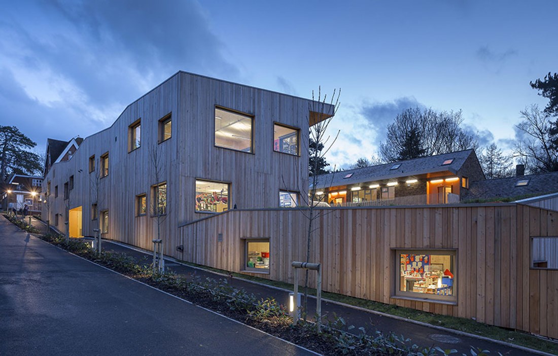
WHEN IT CAME TO building Hilden Grange Preparatory School in Tonbridge, in the English county of Kent, involving the children was not as easy. The parents and staff, on the other hand, were enthusiastic about the tired temporary classrooms finally being replaced with a modern new complement to the old manorial school building up on the hill.
“We held several workshops with all the youngest children about how we would build an amphitheatre with an unusual and challenging outdoor space,” relates architect Roger Hawkins, explaining that in other projects he is able to involve the pupils a little more, but in this case the school itself was not the client. That was the Alpha Plus Group, which manages the school.
“This is a sensitive site and we wanted to create something that stood in stark contrast to the red brick architecture of the century-old main building. We wanted something softer and more welcoming for the children, who are aged 4 to 13, more like garden pavilions that sit comfortably in the landscape. We brought in a landscape architect, who designed the wildflower meadow on the roof of the east wing,” says Roger Hawkins.
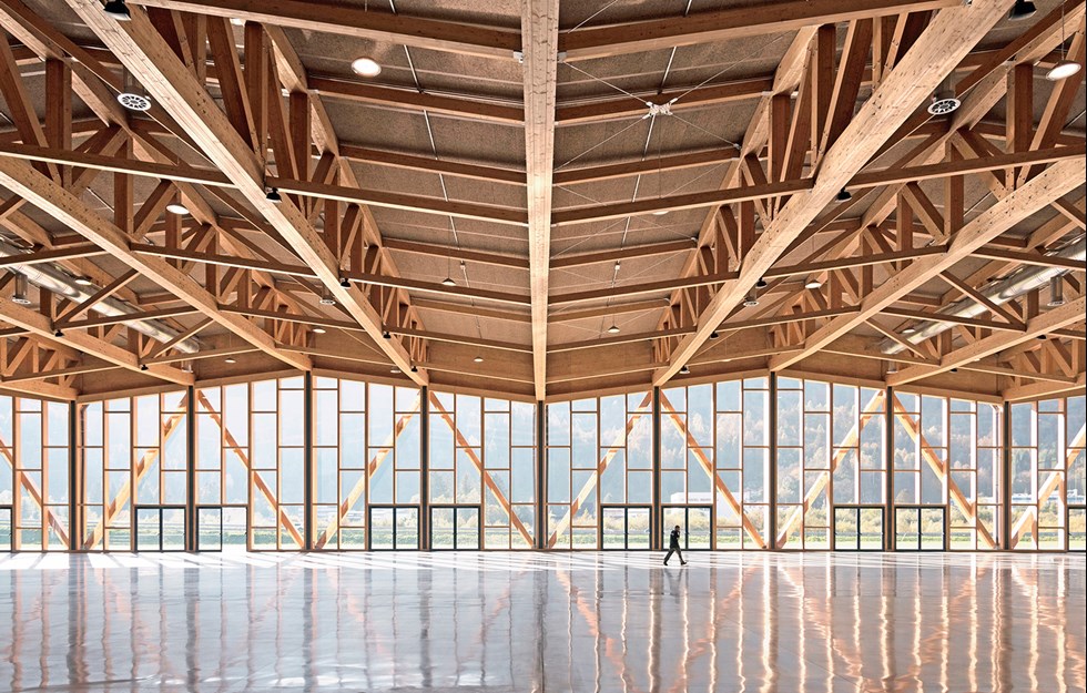
The two wings of the school are joined together by a school hall and canteen, which can accommodate all the school’s pupils. Roger sees wood as an obvious choice. Like the client, he saw wood as a way of speeding up the building process, and as a cost-effective solution, not to mention the purely environmental benefits of wood, benefits that were spelled out in life cycle analyses. To avoid too polished a look for the exposed design, cross laminated timber was chosen with traces of knots and irregularities.
“The choice of a prefabricated design using CLT made the most sense. Access to the construction site was not exactly great, along a narrow road that would also be used by the school’s staff and parents,” says Roger Hawkins.
The school library rises over several floors and strong accents of colour have been used throughout to mark the different parts of the building. The roofs are tiled with Western red cedar shingles, and the facades are larch, which requires minimal maintenance.
“The structural timber frame for the central section is a hybrid, where we used steel struts to brace the long spans that measure between 15 and 20 metres. We’ve managed with natural ventilation, except in the canteen, kitchen and toilets. Overall, this has been a highly cost-effective project,” states the architect.
Roger Hawkins believes the UK has a long way to go to reach the same level as other European countries, not least Sweden, when it comes to building in wood. The big problem is finding clients with the courage to think along non-traditional lines.
FINDING CLIENTS WHO want a wooden building is rarely a problem in Austria. The country has an impressive portfolio of modern wooden architecture, not least in Vorarlberg in western Austria. Here there is an all too rare sense of detail in the architecture, largely thanks to recurring competitions for public projects. The young architect Bernardo Bader, who runs the architectural practice of the same name, is one of the figures driving the country’s wood building traditions forward, as epitomised in the Kindergarten Susi Weigel in the rural town of Bludenz. The preschool has an almost graphic simplicity that is reinforced by the beautifully detailed fixtures and fittings in wood, which focus on children at play.
“Our aim was to work with natural and strictly organic materials,” explains Bernardo. “Our client, the town of Bludenz and its mayor Josef Katzenmayer, contributed timber from its own forest, which cut our construction costs and made the project more sustainable and rooted in the locality. For the facade, we used Scots pine that will age naturally without the need for maintenance. We avoided all non-natural building materials, and all the wood is treated with natural products.”
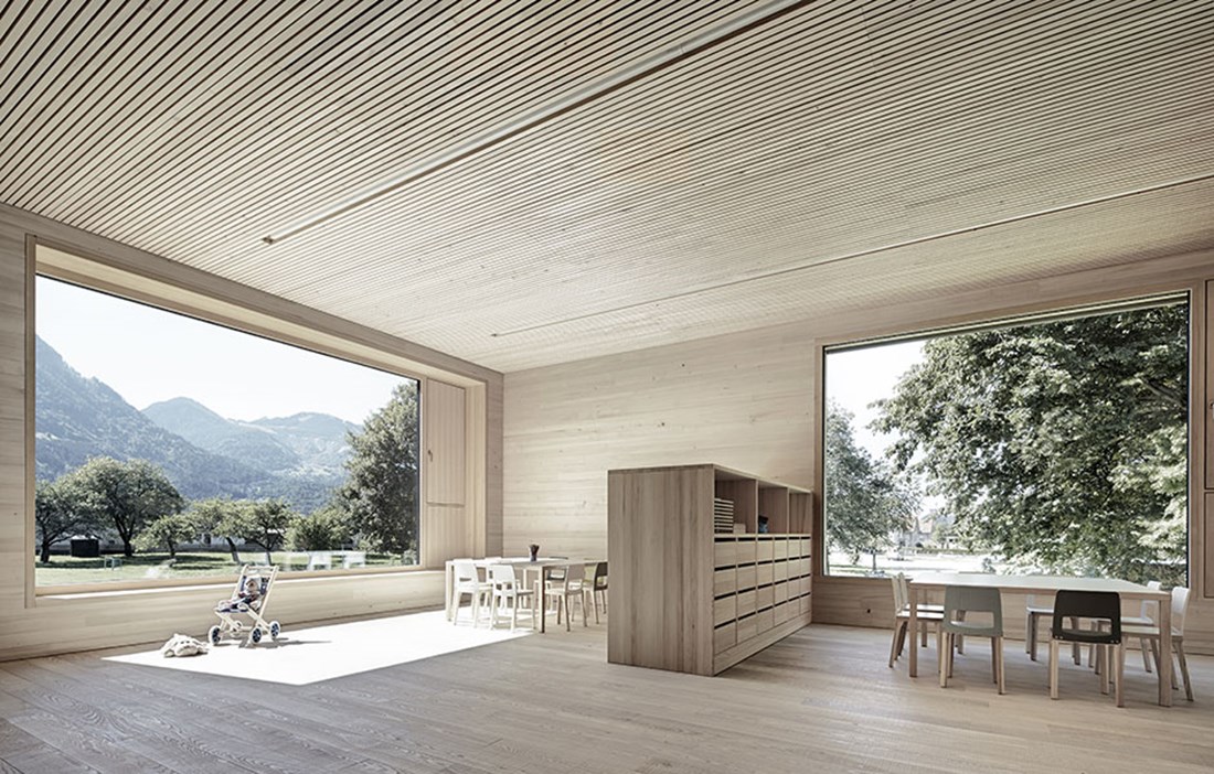
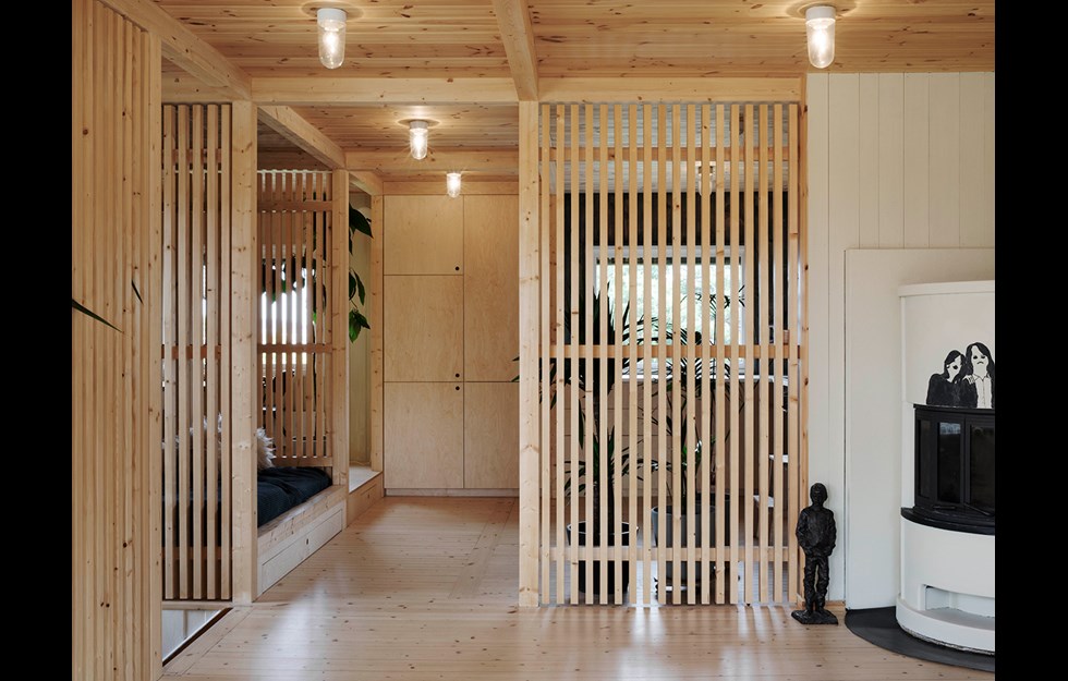
Framing the views are generous windows with sills that make lovely window seats, while the locally harvested timber ties in with the surrounding landscape. Interior walls in silver spruce give a light and airy environment that is accentuated by the clean, open layout, which links together the two floors with a freestanding staircase and mezzanine. The building is frank in its self-confidence. The exterior acts as a geometrically precise skin for its inner workings. The concrete in the load-bearing walls in the middle of the building is as boldly exposed as the different types of wood in the facades, walls, ceilings and floors.
“Most of us have children, and my wife is a preschool teacher. I spent an awful lot of time studying the way my children play outside and inside to try and understand what they like and what they miss, so I could incorporate that into our architectural design. All the furniture is on a slightly smaller scale, of course, and all the spaces are multifunctional.”
CHILDREN’S AUTHOR SUSI WEIGEL has lent her name to the preschool, and her illustrations inspired colour specialist Monika Heiss to paint the thin stripes that line all the doors like a grid. The school’s five classes each have their own playroom as well as a more intimate space. In addition, all the 100 children share a large area for joint activities.
“The preschool is located on the edge of the town, and we’ve chosen to have the large windows facing the landscape, so the children can see the mountains and fields instead of other buildings. The children feel more like part of nature than part of the town.”
With its restrained look, Bernardo Bader’s school building would not be out of place in a spa complex. Nevertheless, the children feel perfectly free to use the building exactly how they want to.
Text Leo Gullbring

