AS LAKE MELASJÄRVI’S fog banks slowly creep up towards the art museum in Mänttä, they give the whole landscape a feeling of being in an episode of Twin Peaks. There is no sign of a museum, just an impenetrable patch of forest at the water’s edge. But is there a light somewhere inside? A window?
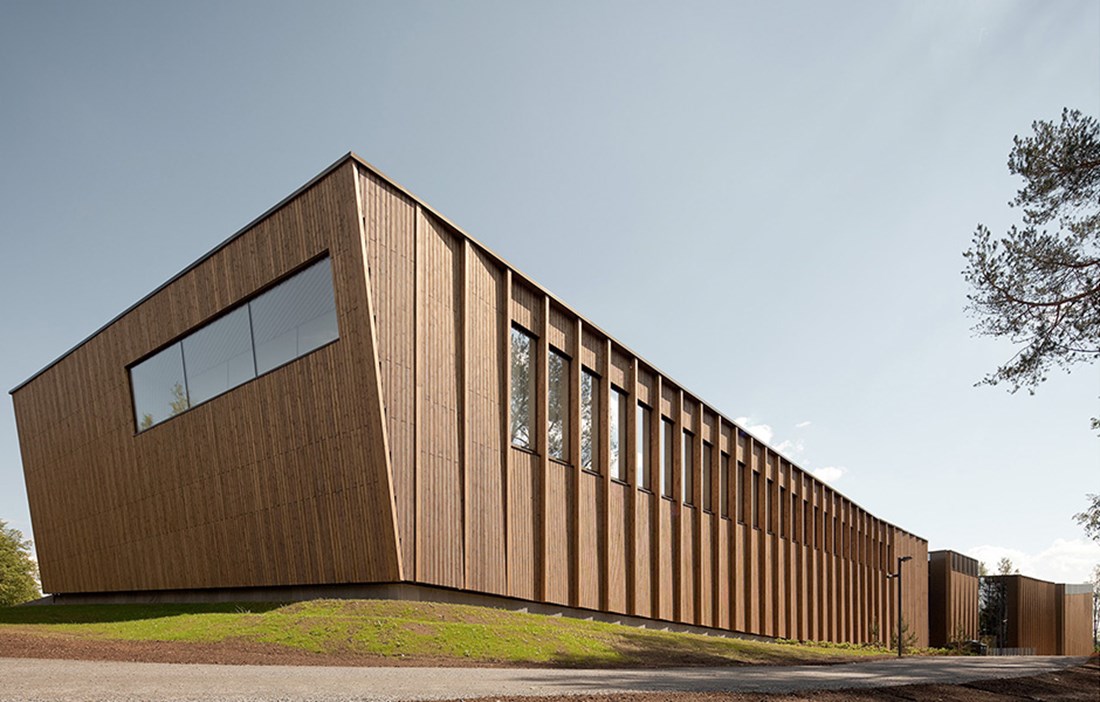
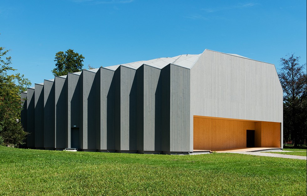
Gösta Art Museum is designed as a kind of abstract forest, with the vertical façades of the wooden pavilion taking their cue from – and merging in with – the surrounding forested landscape. Alongside the museum is the manor house that was originally the private home of Finnish industrialist Gösta Serlachius.
Serlachius had a large art collection and dreamed of setting up an art museum, a project that Finnish architect and designer Alvar Aalto was involved in. However, the project was shelved on the death of Gösta Serlachius. A few years later, in 1945, the ground floor of the manor was turned into an art museum, one of the first in Finland, and in 1984 all the floors were opened up as galleries. A few years ago, it became clear that the existing space was too small and a new building was planned. The ensuing architectural competition became the biggest in Finland’s history, with 579 entries from 42 different countries. The winning design came from a firm of young Spanish architects, MX_SI.
“When we first saw the manor house and the landscape, we were struck by their beauty. The challenge was therefore to create a building that stood in dialogue with these existing elements,” explains Hector Mendoza, chief architect at MX_SI.
The new pavilion, erected next to the manor house, trebled the size of the exhibition space, which now totals 1,500 square metres. In working with volume, space and perspective, the architects created a museum building that in no way detracts from the manor house.
“Although the building is rectangular in shape, it doesn’t come across that way. On the approach to the museum, visitors almost never see its full length, because it’s broken up by small courtyards. Using wood as a material also gives a soft façade that works well with the sensitive landscape.”
GÖSTA IS ONE of the first large-scale public buildings in Finland to use wood for both the structural frame and the façade.
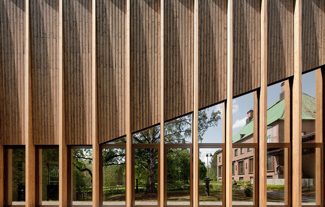
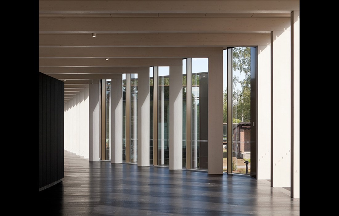
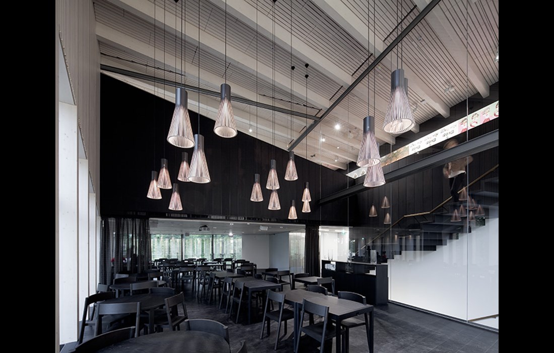
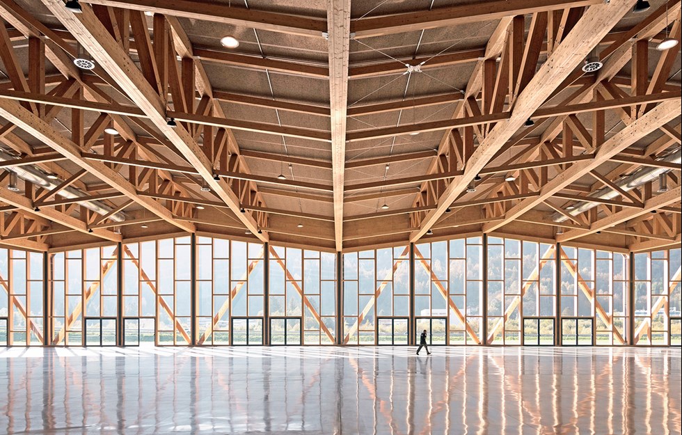
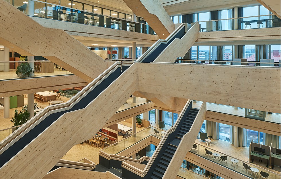
Apart from the floor, which is oak, the wooden elements are entirely made using spruce from the local forests. Glulam forms the structural elements such as the beams, columns and supporting posts along the façade, while solid spruce cladding is used to finish the façade and roof. The architects chose to paint a semi-transparent varnish over the whole façade. Knowing how wood ages, they wanted the building to retain its colour for the first few years, before then fading to shades of pale silver. The 100 or so glulam frames that support the building remain visible inside and out, in part to accentuate the beautiful, gently curved shape of the roof, and so that visitors are able to appreciate how much wood has been used. The whole building is a mix of industrially manufactured wood panels and details that were finished on site.
The structural frame is prefabricated, while the majority of the façade cladding, for example, was fitted by local craftsmen.
“It would have been impossible to build the museum so quickly and with the necessary precision, without using prefabricated panels to some extent. However, we would never have been able to express the warmth and essence of the wood, without the craftsmanship that the joiners provided,” says Hector Mendoza.
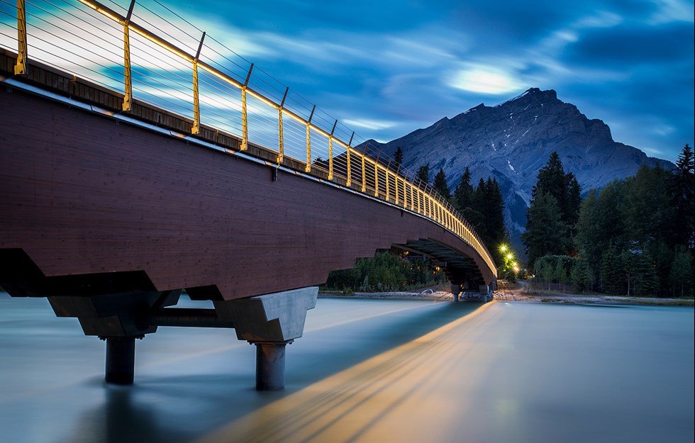
Alongside the art museum, there is also a sculpture park displaying many works by Harry Kivijärvi. From the park, visitors can then continue, via the 53 metre long bridge that MX_SI designed to go with the museum building, to the island of Taavetinsaari, which also has art on show. Small footpaths joining the courtyards form an extension of the way visitors move indoors, creating a further relationship between the interior and the exterior. Everything is part of the cultural experience that MX_SI wanted to establish, with the architecture reinforcing the impact of the art.
“Visiting Gösta is no linear walk, but an emotional journey, full of surprises and one that constantly places indoor and outdoor experiences in relation to each other. This is a journey that begins even before the visitors have entered the museum,” relates Hector Mendoza.
THE LONG WOODEN BUILDING is elegantly broken up into smaller volumes with the help courtyards and generous window openings in the façade. The forest, which is a constant presence, effectively connects the pavilion with the interior and the art.
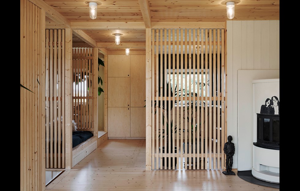
“We put a lot of work into the façade. Particularly the arrangement of the cladding, a detail that is unique to this building. Sunlight filters through the façade and creates attractive shadows on the floor of the museum.”
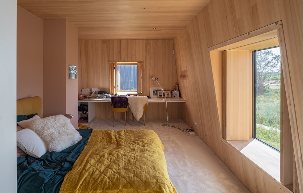
One of the biggest challenges for the architects was preserving as many features of the original competition entry as possible through the whole process. Of these, the building’s sensitive and refined geometry was particularly important. For example, the roof inclines slightly towards the middle of the museum to prevent lines of sight to and from the manor house. Down by the water, the pavilion rises up and becomes more prominent. And then there are all the angles, of course. There are lots of them at Gösta.
Hector Mendoza explains:
“All the angles caused us a fair few headaches. Although they all follow the same concept, there are barely two that are the same. Careful planning was required for every little corner of the building. But we managed it – and exactly on schedule, which was probably our greatest achievement.”
TEXT Erik Bredhe

