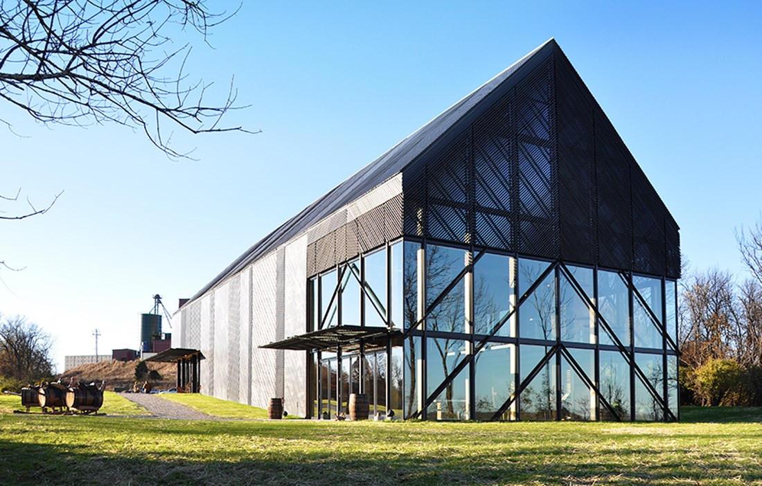
THE SMALL TOWN of Lawrenceburg in the US state of Kentucky boasts 10,000 inhabitants and two distillers of bourbon, a type of American whisky: Wild Turkey and Four Roses. The Wild Turkey distillery sits on a bend in the Kentucky River, a little way outside the town. In November 2013, the distillery opened a new visitor centre up on a hill with views across the local landscape. The task of designing the building fell to architect Roberto de Leon and his practice De Leon Primmer Architecture Workshop. Wood was an obvious choice of material for the building.
“Above all, it was a financial choice, coupled with the fact that most of the materials could be sourced locally,” relates Roberto de Leon.
THE AREA HAS a long tradition of building in wood, not least when it comes to the barns for tobacco storage that are common in the region, and that also provided the inspiration for the centre’s design.
“There is also a reference to the actual bourbon production. The mash is stored in large cypress barrels and the finished bourbon is matured in oak barrels that have been charred on the inside,” describes Roberto de Leon.
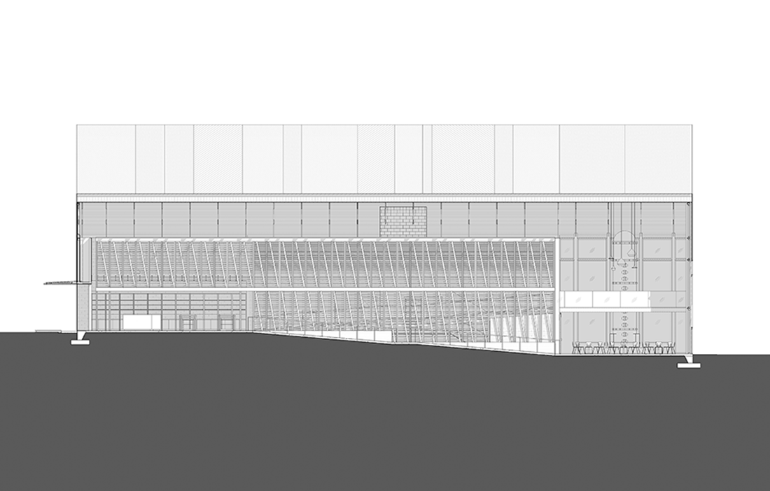
The building may call to mind a traditional tobacco barn, but the architect chose to tweak the shape in various ways. The much steeper roofline, for example, makes the distillery’s visitor centre stand out from a distance, in a landscape dotted with tobacco barns at regular intervals. Closer up, the standout feature is the advanced façade pattern and the diagonal laths.
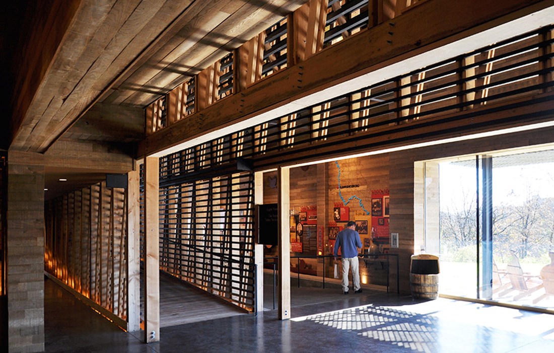
THE BUILDING OF just under 3,000 square metres leads visitors on a tour through the whole production process and the history of the brand. The tour ends with bourbon tasting on a terrace overlooking the river. The interior is designed as a cohesive walk across several levels.
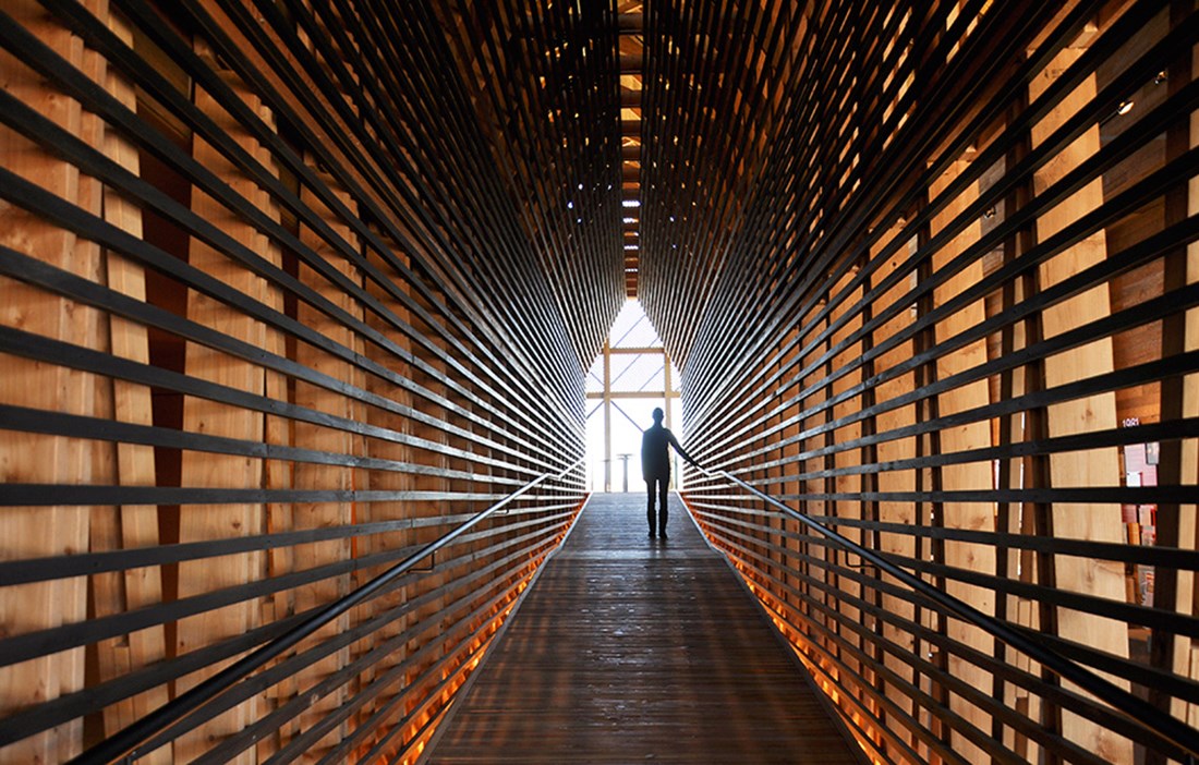
“Visitors are drawn through the whole building, so they can really experience it. We’ve intentionally made it difficult to capture the building’s interior in just one photograph, we want the visitors to engage with the entire narrative,” says Roberto de Leon.
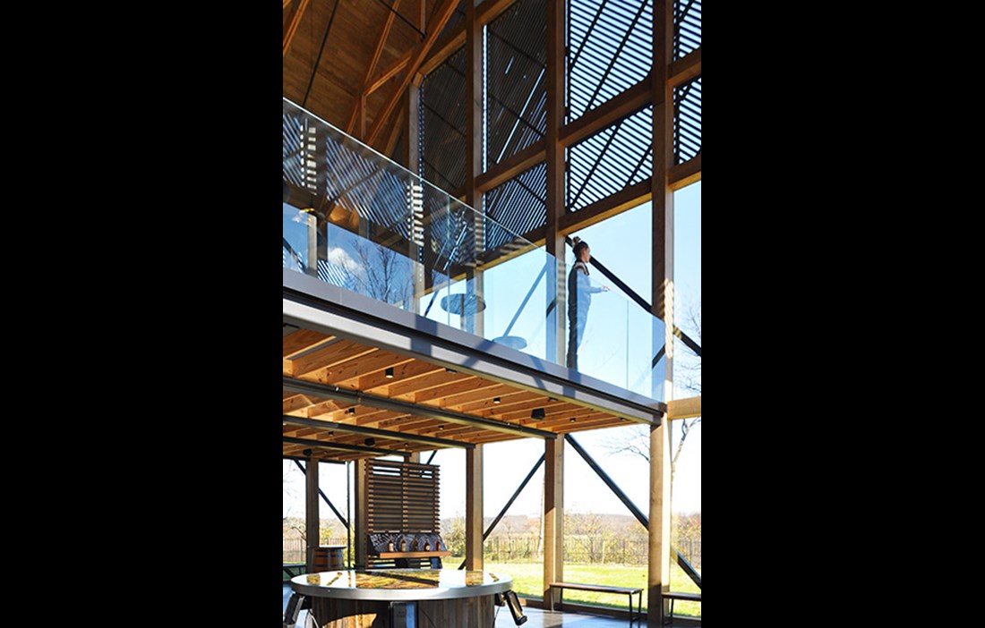
Several different woods were used in the construction: in addition to pine in the structural frame, there is Douglas fir in architrave and skirting, ash in various interior fittings and cypress in the narrow laths that give the façade its character. The diagonal laths, mounted on glass, posed quite a design challenge, according to Roberto de Leon:
“The laths and glass are mounted in metal frames that can be swung around. This makes it easier to clean the glass, but it also means you can change the appearance of the façade depending on how you position the frames.”
The building’s location on a hill facing east means it is often exposed to the sun’s sometimes unrelenting rays. The laths allow for the amount of light to be controlled and provide an exciting play of light inside the building, as the sun moves over the course of the day. There is also a reference to the gaps between the boards cladding old, creaking barns. The black stained exterior, also inherited from the building’s inspiration source, is partly a reaction to a special kind of black mould that thrives in the distillation vapours from the bourbon production. A black façade means the harmless mould does not have to be cleaned off as often.
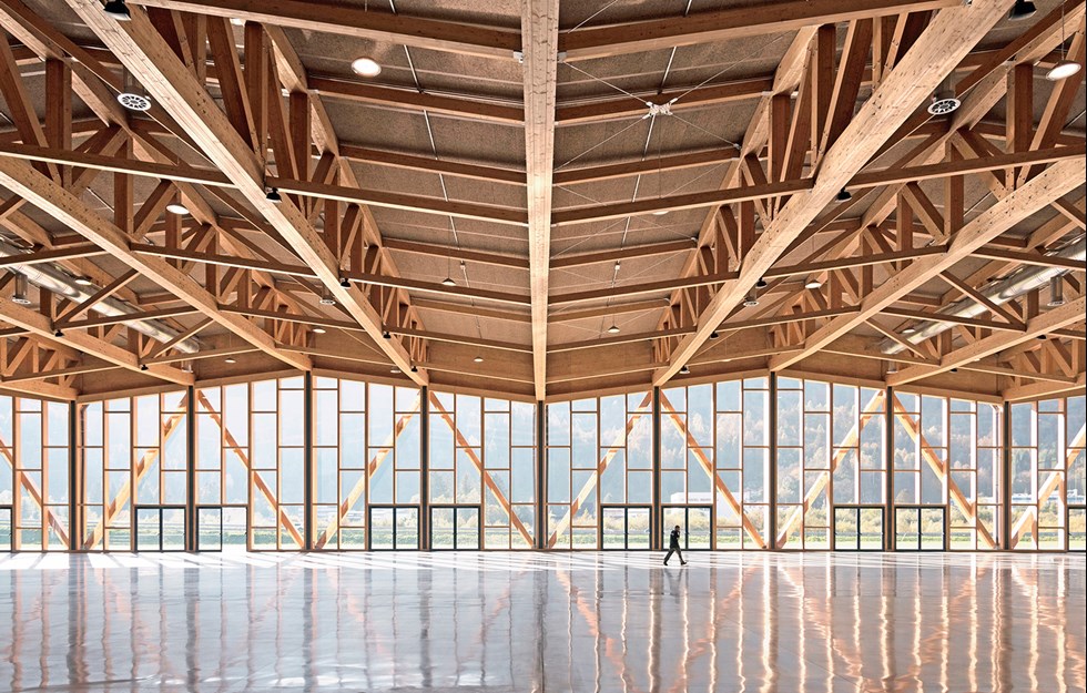
ANOTHER CHALLENGE WAS the roof structure, with its exposed trusses. Technically, they are based on the barns that inspired the whole building. However the size of the building, the steeper pitch of the roof and the unusually large span between the supporting walls required specially constructed roof trusses that were tricky to install. The building’s open position on a hill makes the site uncommonly windy, which did not help when lifting the roof trusses into place. Generally, the project placed major demands on the architect and the builder, explains Roberto de Leon.
“Many of the details we designed for the build were new and unfamiliar to the contractor. This led to a lot of discussion on site to resolve various technical complications.”
More unexpected challenges came in the form of old foundations that were uncovered during excavation work, and a previously unknown section of bedrock that forced the architects to rethink the floor levels. The fact that the building had to be accessible to large numbers of visitors also led to certain challenges.
“The visitors’ experience is intended to begin long before they enter the building. We created a consciously extended, winding approach road that leads up the slope and reveals the building a little at a time. In a similar way, we wanted to integrate the architecture into the design of the exhibition,” says Roberto de Leon.
ROBERTO DE LEON DESCRIBES the greatest challenge of the project as creating a seamless environment, where the exhibition and the bourbon brand’s marketing merge with the architecture. It was a case of building up a narrative in which all aspects of the distillery play a part. This took a considerable amount of coordination with the company that created the exhibitions.
“We wanted the various elements to be integrated into the entire building and not just packed into a single exhibition room,” says Roberto.
Is there any part of the building you are particularly pleased with?
“We’re proud of the way the building changes through the day, thanks to the play of shadows and the light that filters in through the glazed areas. The effect of the laths is even more dramatic in the evenings, when the building lights up the landscape like a lantern.”
TEXT: Mårten Janson

