HOW ABOUT A 1,6 km long conveyor-belt pizza with 2 tonnes of mozzarella and 700 kilos of tomatoes? Expo 2015 is a culinary competition, where 145 participating countries, companies and organisations try to outdo each other. The two themes of the World Exhibition ‘Feeding the Planet’ and ‘Energy for Life’ are, however, more serious, what with the threat of climatic disaster and overpopulation.
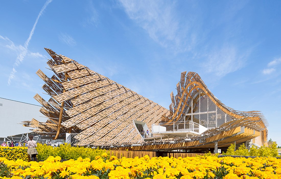
It is hardly surprising that wood features in countless pavilions. After all, nature’s building material goes hand in hand with a sustainability approach and gastronomic culture. China engaged Tsinghua University, and former student Yichen Lu of US firm Studio Link-Arc, to bring traditional Chinese architecture up to date with a billowing lightweight roof in bamboo – a cloudlike structure that shows how city and country can live in harmony.
Japan’s Atsushi Kitagawara was inspired by traditional Kyoto houses for his highly earthquake-proof design with no metal parts, and a wall of sake barrels in the entrance. Spanish architectural practice B720 Fermin Vazquez Arquitectos has served up a prefabricated pavilion made from glulam beams which, according to the architects, has considerably reduced transport needs and created a flexible, easily assembled structure. The enormous greenhouse has energy-efficient natural ventilation and polycarbonate instead of glass.
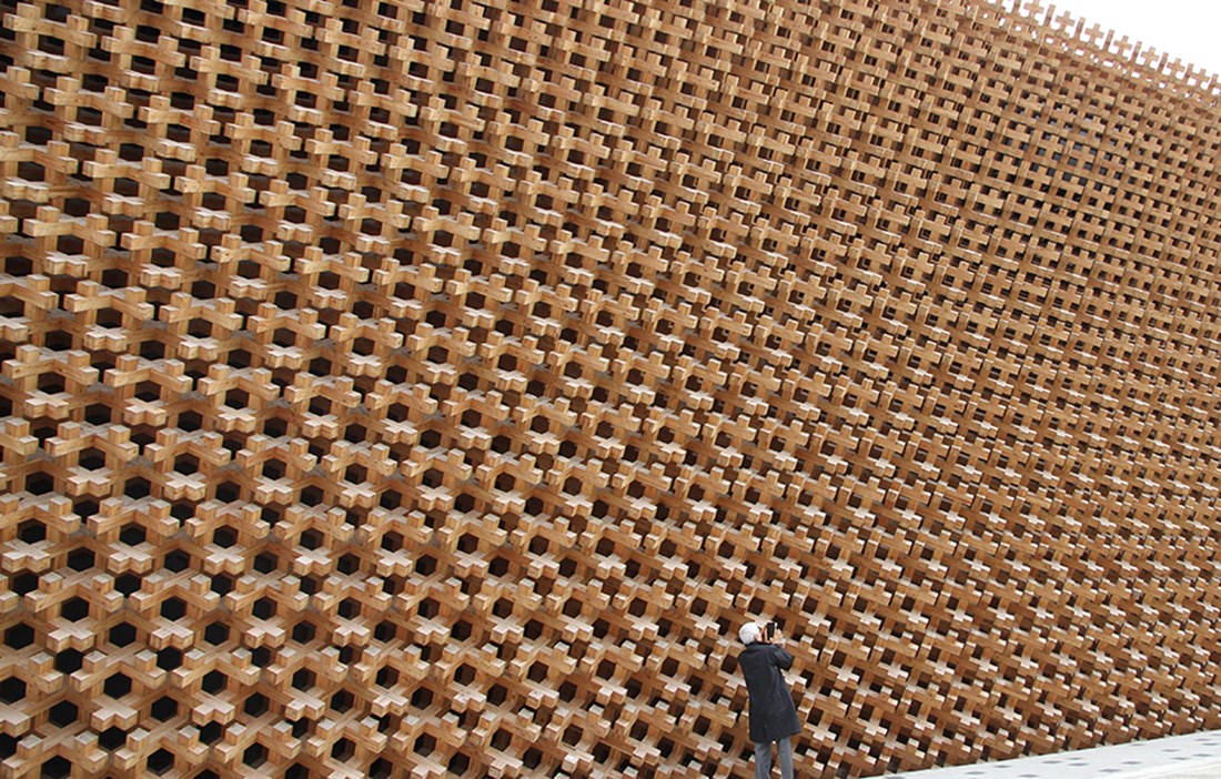
THE CHILEAN PAVILION, just next to the concert arena, by Undurraga Deves Arquitectos goes even further, and looks like a large wooden lattice box raised on six steel supports. According to lead architect Sebastián Mallea, wood was a natural choice for a transparent experience from both inside and out, providing different types of scale with which to relate.
“As well as having the lowest possible environmental impact, wood is also a generous material that allows a flexible room design and is suitable for load-bearing, dividing and as a surface finish. It works superbly in prefabricated systems, and is easy to put together and take apart, he continues.
“We chose Monterey pine from controlled sources in southern Chile, because it has a warm quality and gives a very particular light. The smell also helps with the overall appreciation of the environment. We’ve used as few metal ties as possible, and most of them have been embedded for aesthetic and fire safety reasons.”
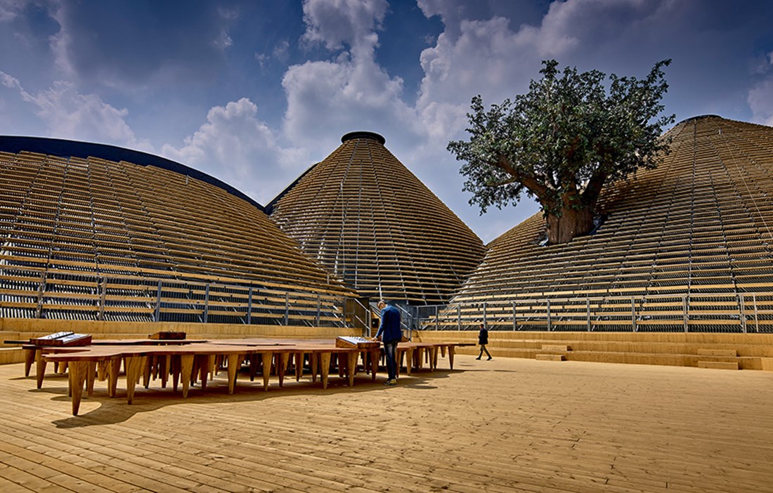
If the Chilean pavilion is rather conventional, Italian architect Michele de Lucchi has pulled out all the stops for the Expo’s entrance building, and above all the strategically placed Zero pavilion, measuring 8,000 square metres, whose name reflects the UN’s Zero Hunger Challenge.
“We almost always work in wood,” explains project architect Angelo Micheli. “The spruce was harvested in Trentino, where wooden architecture is much more taken for granted than in the rest of Italy. Zero takes the form of a number of 20 to 26-metre tall hills, which are meant to show humanity’s relationship with nature since time immemorial.”
The Zero pavilion is clad in spruce boards that are supported by a metal structure. Internally, it is like a cut-out of the Earth’s crust, with dozens of caves inspired by the Eugenia Hills between Padova and Vicenza. Wood also figures in a Noah’s Ark and a 23-metre tall Tree of Knowledge that breaks through the ceiling.
“The structure has been driven here directly from the sawmill and assembled in the simplest way, reinforced with a steel frame. The lanterns serve as heat vents and lower the indoor temperature four degrees without mechanical ventilation.”
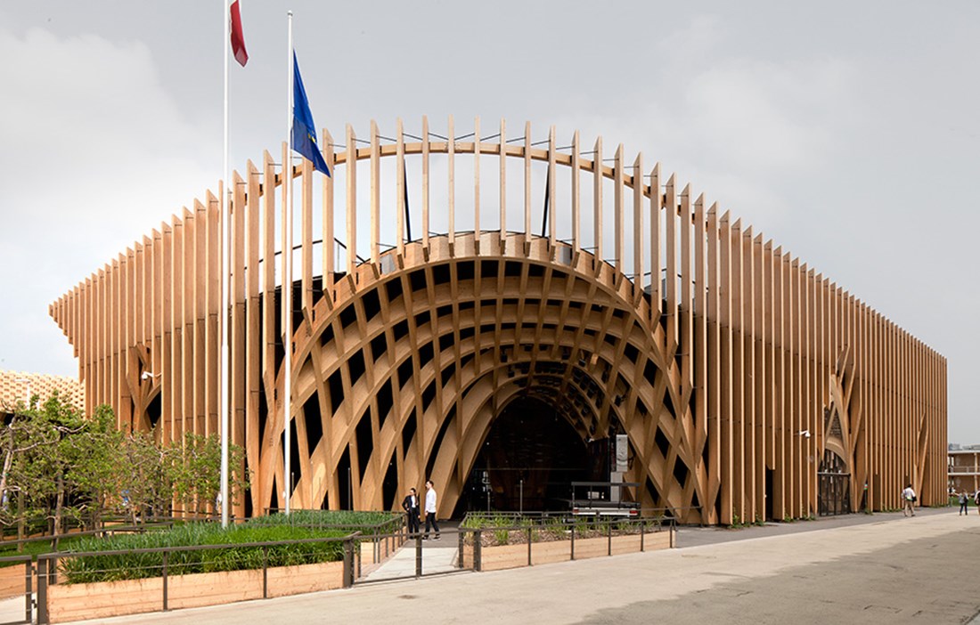
THE MOST ADVANCED offering is the French pavilion, which Agence XTU’s architects Anouk Legendre and Nicolas Desmazières have designed as a giant pergola for climbing plants and vegetables. The boxlike ceiling has been filled with wonderful examples of the nation’s gourmet culture.
“Wood is more sustainable than other materials and the obvious choice to fit in with this year’s theme,” explain Anouk and Nicolas in unison. “Our glulam beams supported by columns create a lightweight structure made entirely from French wood: spruce for the interior and larch for the exterior.”
The curving and embracing design is reminiscent of Pier-Luigi Nervi and Félix Candela, but here it is made entirely in precision cut wooden components that lock each other into place at right-angles, minimising the need to add and embed steel ties. The idea is that after the Expo, the pavilion will be taken down and given a new life in France.
“We achieved this almost plastic structure with the help of industrial robots.”
EXPO 2015 IS NOT without its critics. Architect Stefano Boeri and his colleague Jacques Herzog produced the Roman-inspired design for the site: a 1.5 kilometre long decumano (main street) and a number of cardine (cross-streets) housing the pavilions.
“We wanted to do something different from a typical 20th-century World Exhibition, with all the pavilions in rows,” explains Stefano. “Every country would have a plot of land to showcase their best agricultural products, and advanced bioclimate solutions in the form of large greenhouses. An Expo with a focus on how we can survive on this planet. What we ended up with was basically a big food market…”
Stefano almost became mayor of Milan in 2011 and is behind Bosco Verticale, a pair of residential towers that create a ‘vertical forest’. His Swiss colleague Jacques Herzog is an even bigger name on the international architectural scene. When the team lost control of the job, Jacques vented his fury in the press.
“We accepted the invitation to design Expo 2015 on condition that we could give it new content, not more of these monuments to national pride that have defined world exhibitions since the mid-20th century. Now Expo 2015 is just another vanity project filled with spectacular buildings.”
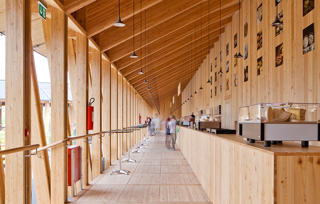
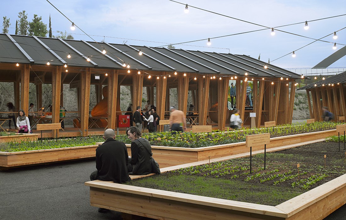
SLOW FOOD DID, however, invite Herzog & de Meuron to design their pavilion. Would it be possible to recreate the spirit they had dreamed of? Three pavilions built from chunky, gently angled glulam beams provide a spartan backdrop to all Slow Food’s sensational regional foods. Airy and simple like the old barns of Lombardy, like a food market out in the countryside. The pavilion promotes endangered foods and sensual pleasure.
“We chose wood because it’s sustainable, easy to work with and suitable for prefabrication,” says Herzog & de Meuron’s team of architects, led by Liliana Amorim Rocha. “Partly because we only had two months to complete the build, but also so we could disassemble the pavilion at the end of the autumn. We chose glulam because it’s extremely tough and stable, with excellent structural properties.”
Text: Leo Gullbring

