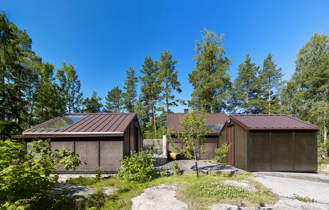
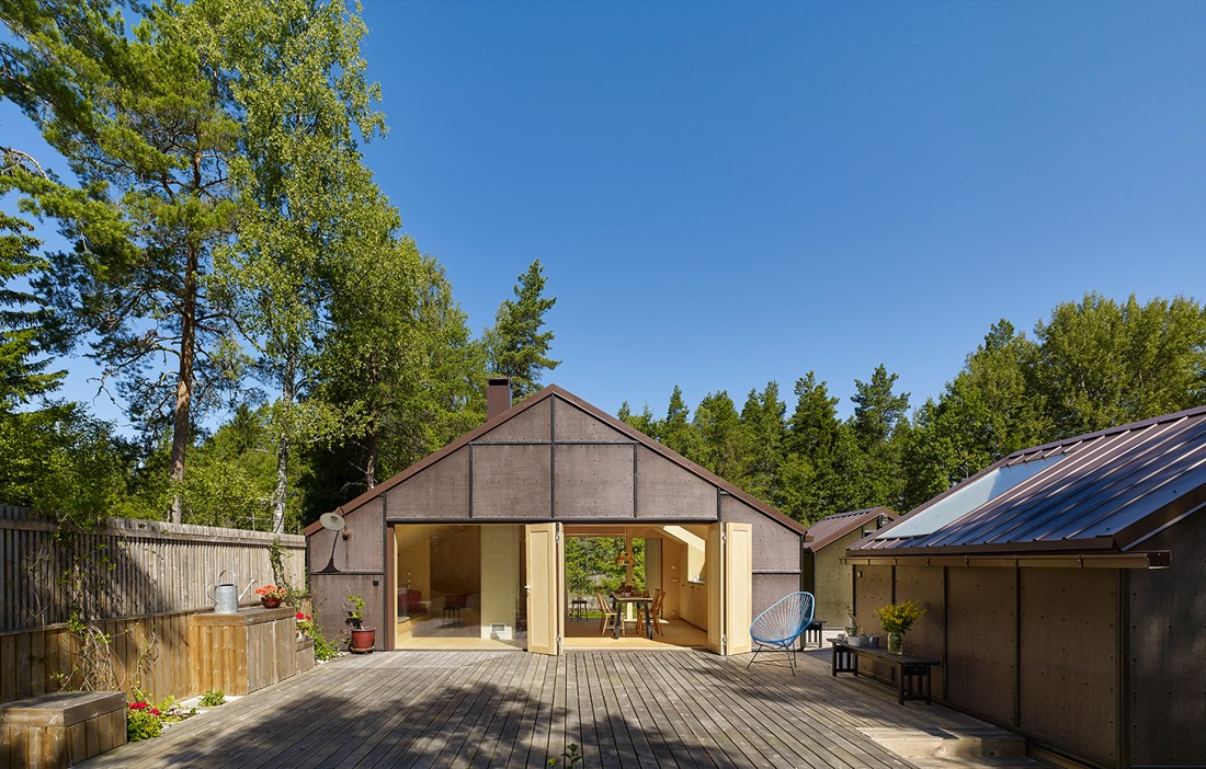
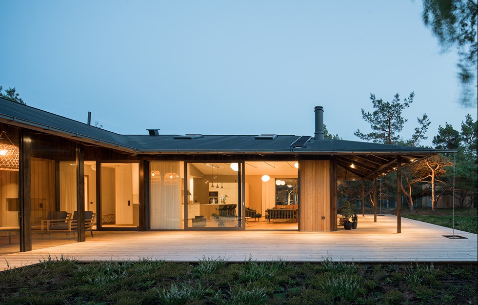
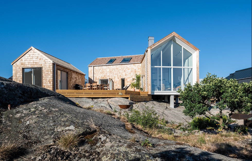
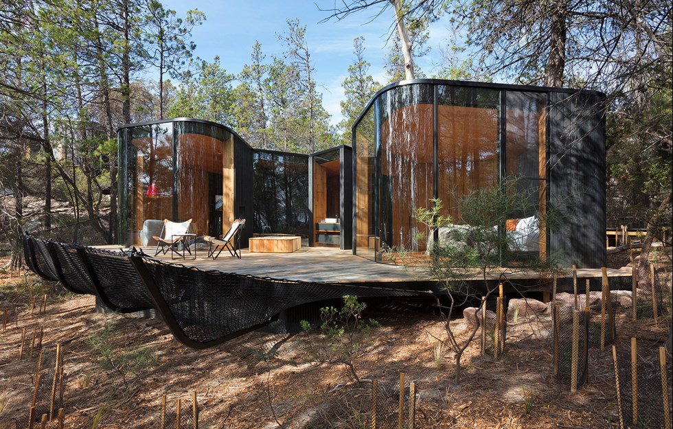
In an area of traditional holiday cottages in Kaggeboda outside Norrtälje sits an odd little cluster of buildings, in the heart of a recreation area. But despite its modern design, it blends successfully with the rocky outcrop, surrounded by tranquil forest. Architect Tove Fogelström had the task of building a little cabin on the same plot as her mother’s summer cottage, a private bolthole and place to sleep when visiting. But as her own family expanded, needs changed and so interest in creating a broader solution increased. The result is three small but functional buildings measuring a total of 62 square metres, bound together by a generous wooden deck to form a single little unit. Wood was chosen as an easy material to handle during construction, and it also allows for extensions to be added in future with the minimum of fuss.
“Wood is the cheapest alternative, compared with other materials, but the focus was also on making the structure as simple as possible. The less groundwork you need to do, the easier it is to extend, and you don’t make as much of a mark on the plot, since it’s not a very heavy material to work with,” says Tove Fogelström.
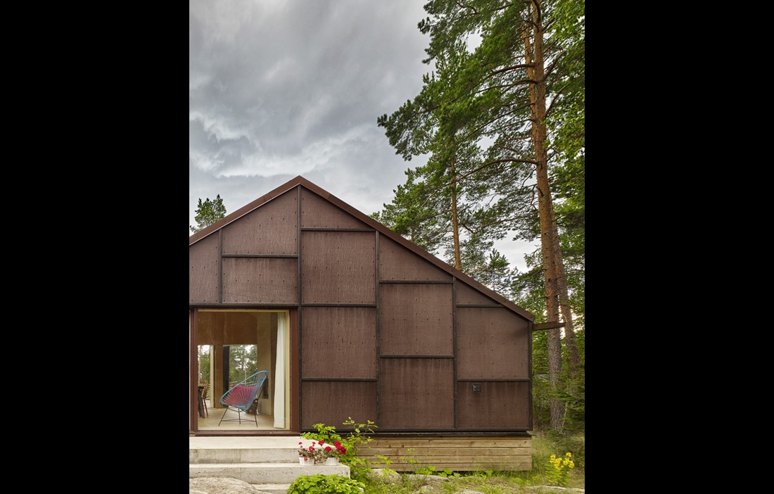
She likens the design to a jewellery box: hard and simple on the outside, but warm and light on the inside. The austere nature of the façades is the result of a carefully chosen material, the shuttering plywood that covers the building’s post and beam frame.
“We chose wood because it’s such a fantastic material! We wanted a more rugged look, and the bold colours and square pattern of the plywood give the house character. A panelled façade like this is also quite unusual on a summer cottage,” says Tove Fogelström.
This is because shuttering plywood is actually used primarily to create moulds for casting concrete.
“The sellers can guarantee that the material is strong enough to contain 50 tonnes of concrete, but not how it works as a façade, for example under prolonged exposure to sun or rain. I’ve often wondered about this, but I’ve been unable to try it out on my clients’ projects. Now that I have tested it, I’d be confident about using the same material for a client.”
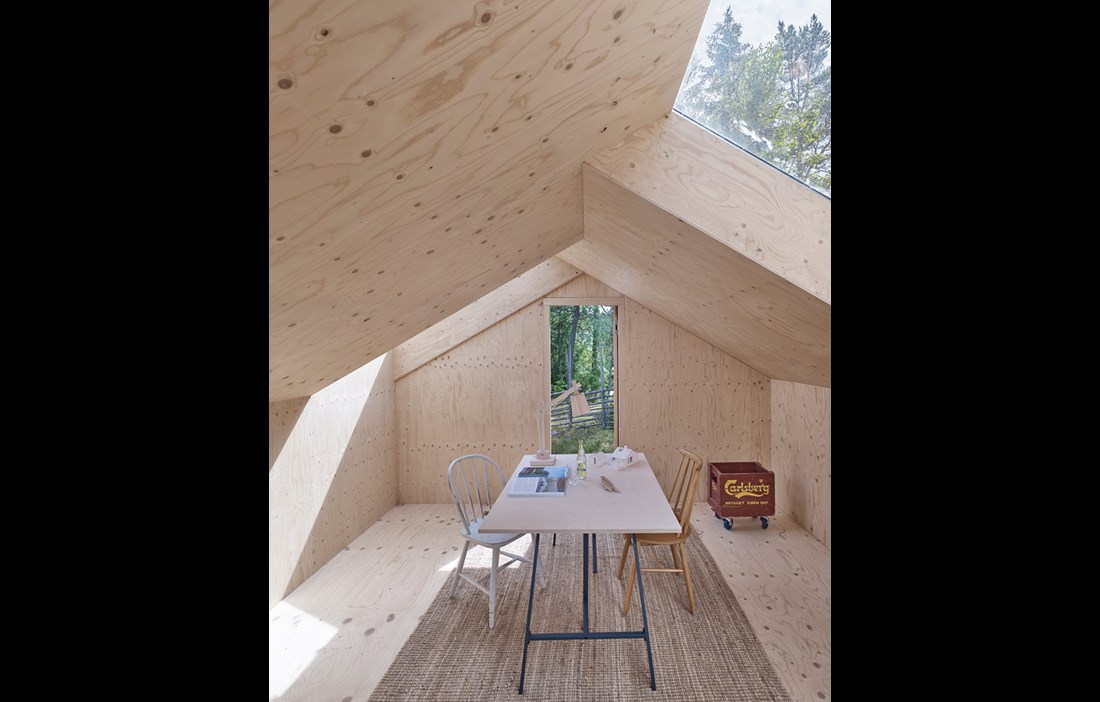
The look of the façades is also accentuated by the steeply pitched metal roof. Planning restrictions for the area limit the use of high façades, but the slope of the roof gives the building a spacious feel inside, with the ceiling stretching all the way up to the glulam ridge beam.
“We wanted to use the ceiling height to get some space into the room and we therefore chose not to build in an attic or a loft,” explains Tove Fogelström.
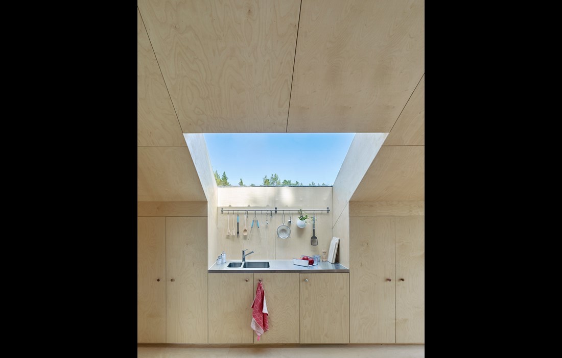
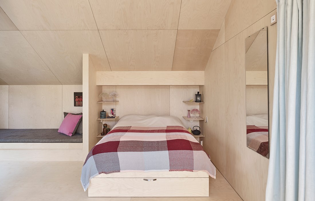
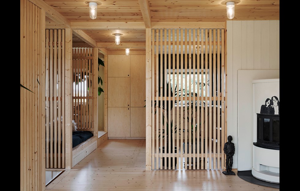
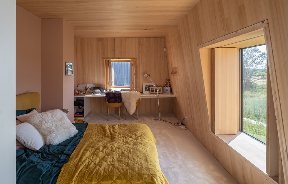
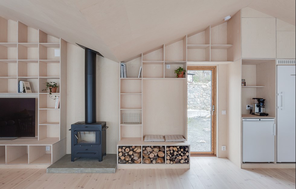
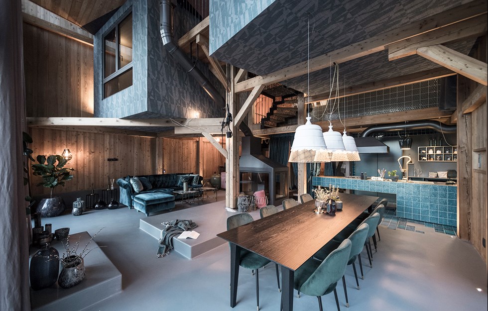
While the exterior makes quite a raw impression, the interior is warmer, this time using light, oiled birch plywood. Folding doors inspired by barn doors, and generously sized windows allow natural light to flood in. The rooflight over the kitchen counter is one example of where form and function have been cleverly combined. The extra space that the design creates makes it possible to work standing up, despite the steep angle of the ceiling.
The main building’s brick chimney has been lined for use with a wood-burning stove, which warms the house along with underfloor heating. The middle building is a small studio and a guest room, while the smallest of the three is currently used for storage, although there are plans to convert it into a bathroom. The current design is certainly complete, but the ideas keep coming and the buildings will continue to be developed as the family’s needs change.
“It’s all about how to live in the countryside. We wanted to create small rooms that enclosed the large outdoor terrace, giving us good contact with nature.”
TEXT Johanna Lundeberg

