There are many sides to Italy, and the region of South Tyrol, or Trentino-Alto Adige as it is called in Italian, is defined by its snow-covered mountains in winter and its fertile valleys in summer. Like a giant, pulsating system of arteries, large parts of the region are criss-crossed by Dolomiti Superski’s huge ski network. We are talking about a total of 1,200 kilometres of pistes and one of the world’s largest connected lift systems, which includes Obereggen.
This season the location, often called ‘The Dolomites’ best kept secret’, has stepped into the limelight and attracted more visitors than ever before. And no doubt the new mountain station that opened in December last year has played its part.
Peter Pichler Architecture in Milan, in partnership with architect Pavol Mikolajcak, won the 2015 competition to design a new mountain station with a restaurant, two bars, a lounge, a sun terrace and various service areas. The site, right next to Oberholz lift station and the adjoining pistes at an altitude of 2,096 metres, was naturally a practical challenge, as was the tight schedule. Construction could not start until the last meltwater had drained away, a few weeks after Easter 2016. The mountain station then had to be completed in time for the start of the season in early December of that same year.
“Firstly, we had to think about how we were going to get all the materials up to the construction site,” recalls Peter Pichler, chief architect at Peter Pichler Architecture.
“A helicopter was one option, but we soon realised that this would be too expensive. The solution was to build a road that will now be used by the many walkers who visit the area in the summer and can’t face climbing to such heights on foot.”
Peter Pichler works out of his office in Milan, but he was born and raised in Bolzano, the capital of the region, where his partner on the project, Pavol Mikolajcak, also works. Both architects express a strong affinity with the stunning Alpine landscape and have great respect for the local building traditions, which have wood as the dominant material.
“Our goal was to achieve a respectful reinterpretation of the traditional log cabin. A modern building that at the same time has its roots in the local vernacular. In this context, wood was the obvious choice. The reference to existing buildings in the area is never far away and it is easy to work with on site,” relates Peter Pichler.
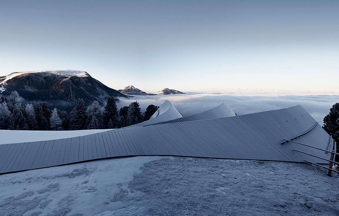
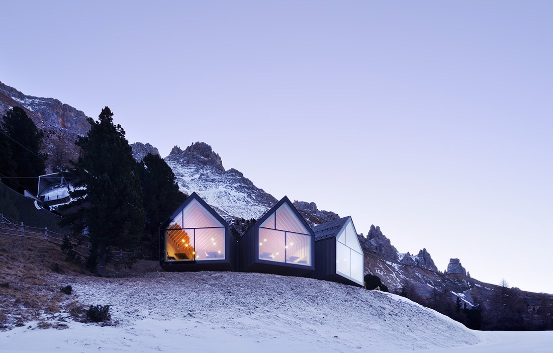
Seen from above, the mountain station looks like a plant that has taken root on the slope and then spread out through the air in search of light. The architects rightly worked hard to create a building in symbiosis with the surrounding landscape. However, they prefer to describe the mountain station as a fallen tree trunk whose three branches reach out towards the peaks of Mendel, Corno Nero and Corno Bianco.
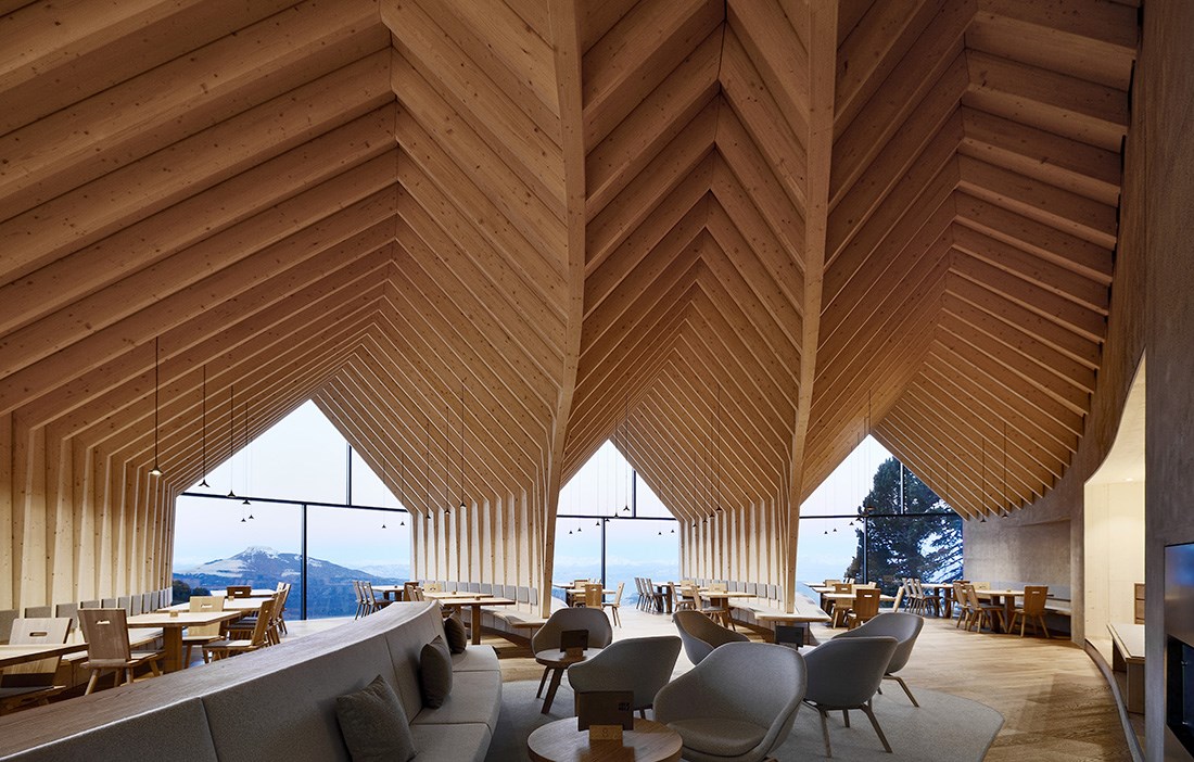
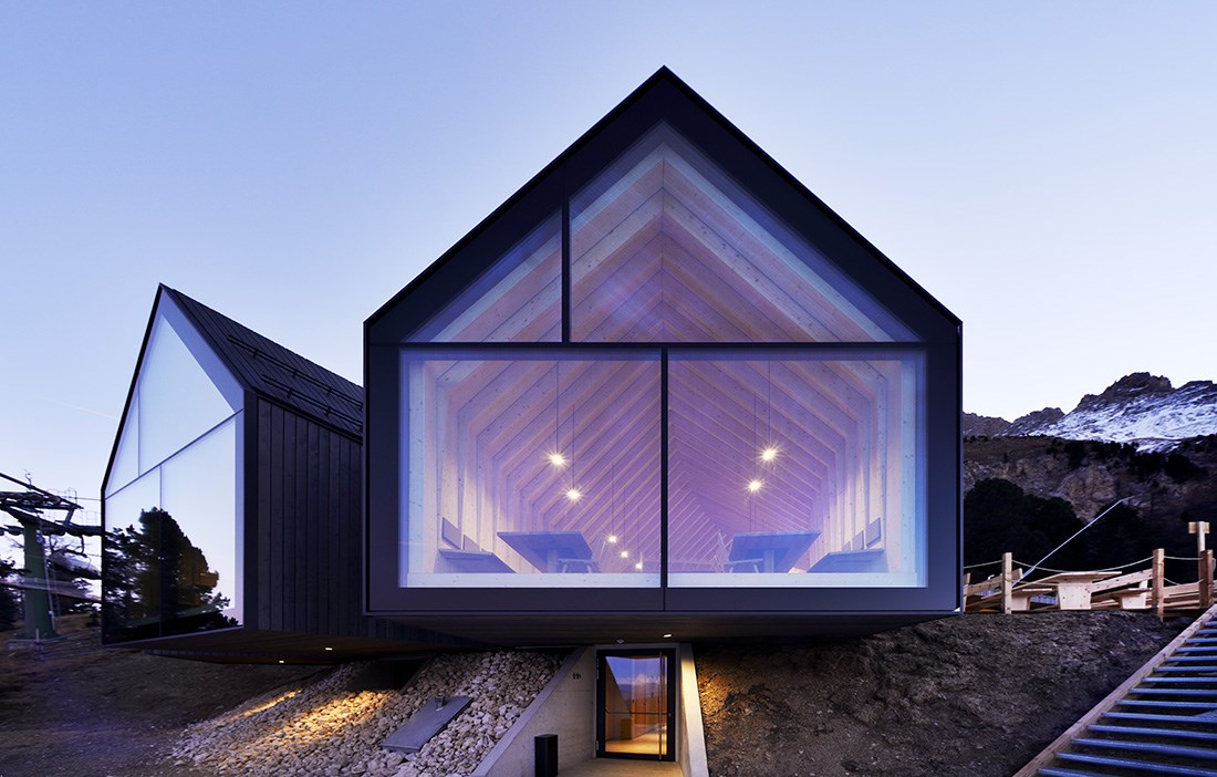
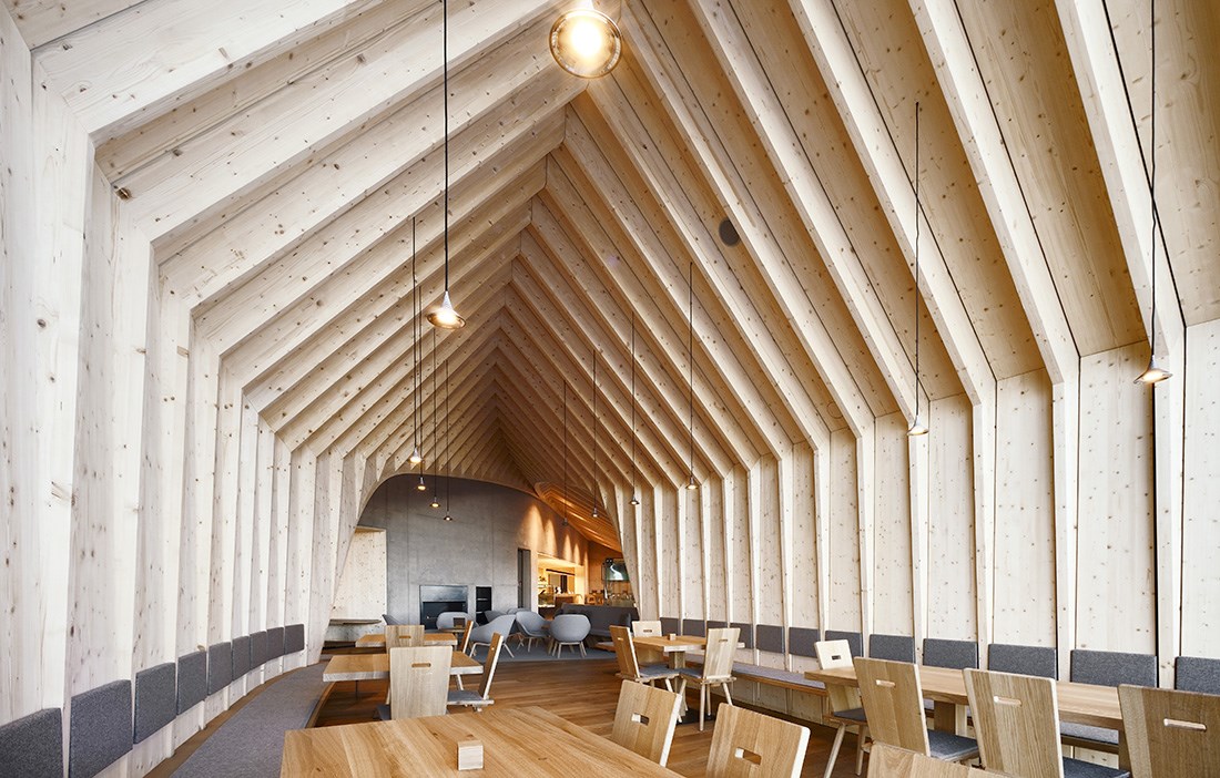
The ground floor is cast in concrete and, like the inner parts of the upper floor, blasted into the rock. The visitor toilets and the installations and staff rooms are housed in this part. The upper floor has the restaurant kitchen, stockrooms and storage spaces at the back, with a 30 metre long concrete wall cutting through both floors to mark the transition to the light, public areas whose cantilevered wooden structure almost floats on the mountainside. The walls and roof are made from close-grain spruce from the surrounding forests, with a billowing frame design in glulam accentuating the organic geometry and highlighting the logical and homogeneous form in local materials.
In this setting, the traditional pitched roofs reflect the mountain peaks around them. The generous height, at up to five metres to the ridge, creates an openness and delivers a formal, almost sacred feel. The pitch varies from 45 degrees to 30 degrees, which means that the roof levels out the further back into the building you go.
“We thought it was important to have an exposed wooden structure, so that the visitors can really understand the building’s geometry and see how the structure grows out from the mountain.
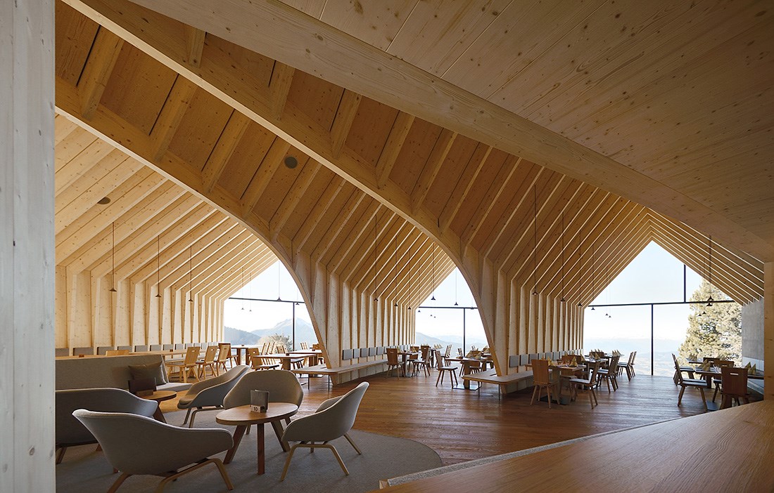
Internally, the open space provides opportunities for many different rooms and functions. To the left of the entrance, there is a generous bar adjacent to the restaurant kitchen. Straight ahead is an inviting lounge area, where visitors can sit and relax by the open fire that is integrated into the concrete wall. The lounge also contains an intimate little hideaway, a slightly raised niche where small parties can enjoy some seclusion.
“We were inspired by the way the dining rooms used to be set out in the small inns of the Alps, what were known as ‘Stuben’, where these rooms within a room were quite common,” says Peter Pichler.
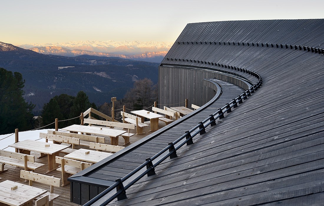
The room is dominated by the building’s three branches, with plenty of space for up to 120 guests. They stretch out towards the three highest peaks in the area and terminate in large glass façades that create views of the slope and the surrounding landscape. These give a sense of infinity and beautifully frame the mighty Alpine panorama, forming three enormous ‘paintings’ whose subjects shift with the change of daylight, weather and season. In the shelter of the curved façade along the side that faces directly south-west, the mountain station has a large wooden terrace.
Internally, the floor and the robust furniture, which includes wall-mounted benches, chairs and tables, is made from solid oak – a hard and durable material.
“The restaurant comes under considerable pressure and during the winter season visitors stomp in with their ski boots, so the floor has to take a lot of punishment,” says Peter Pichler.
Local joiners were involved in the job of making the furniture, to designs based on a classic model from the chair manufacturer Plank. Externally, the walls and roof are clad in larch, which has been surface treated in order to better merge into the setting and give a sense that the mountain station has always been there.
“We were conscious that the larch cladding would grey with time, but we lacked the patience to wait for the wind and weather to give the façade the patina we wanted. Initially, we thought about charring the surface of the exterior cladding boards, but instead we found an eco-friendly surface treatment that instantly turned the golden larch into the silvery grey we were looking for.”
As mentioned before, the new mountain station has already increased the flow of visitors to Obereggen. Next season, even more are expected to make their way here. It is great to see that good architecture can be the way to generate interest not only in a building, but in a whole location.
Read more at Peter Pichler Architecture
Text Katarina Brandt

