The École Polytechnique Fédérale de Lausanne (EPFL) enjoys an idyllic location on the shore of Lake Geneva, with views of the Alps and Mont Blanc. At this prestigious technical university, founded in 1853, over 11,000 people from all over the world study, research and teach on the general themes of science and technology.
As part of the university’s desire for the different parts of a growing campus to be better integrated with each other, in the early 2000s the management set its sights on Place Cocandey, a bare, three hectare lawn laid out in the middle of the site. The dysfunctional lawn formed an obstacle to all the attempts to create natural contact routes – between the school’s social heart to the north and the residential area and lake to the south, and between the departments to the west and the learning centre and library in the huge concrete colossus that is the Rolex Learning Center to the east.
An architectural competition for three different buildings, or pavilions, was held in a drive to revitalise the campus. The winner was Japan’s Kengo Kuma & Associates, with their project ‘Under One Roof’.
“Instead of separate buildings dotted around the lawn, we chose to bring all three functions, science, information and art, under one roof,” says architect and chief designer Javier Villar Ruiz from the practice in Tokyo.
“In our eyes, it was the only way to make the area more functional and at the same time more socially welcoming.”
Construction work began in August 2014 and the building was handed over in December 2016. Over the longer term, the completed Artlab is intended to be an engine for creating a more dynamic campus that encourages a fruitful and cross-disciplinary dialogue between science and the humanities.
“In Japan there is a saying about ‘living under one roof’, which means that individuals with different skills get together and collaborate, which is exactly what Artlab is all about,” explains Javier Villar Ruiz.
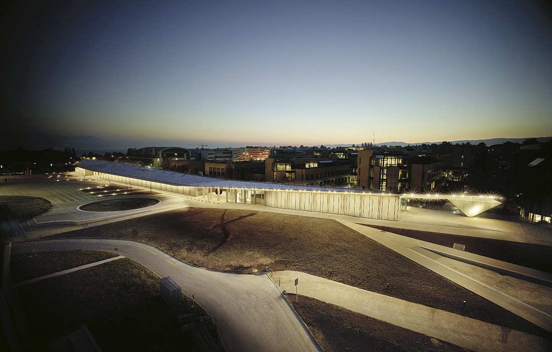
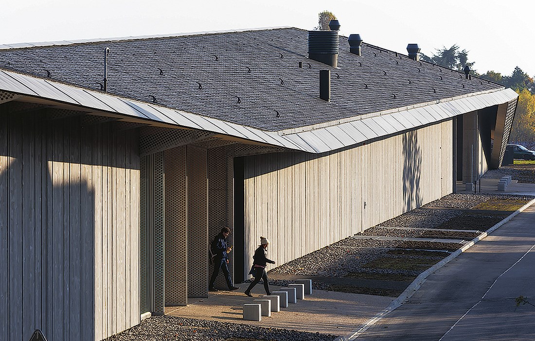
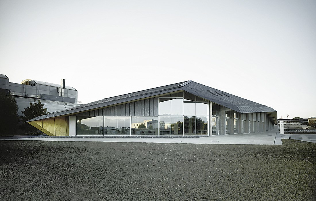
235 metres long and clad with slate tiles, the undulating pitched roof, inspired by Swiss building traditions, conceals three individual volumes separated by large open spaces for through access and events.
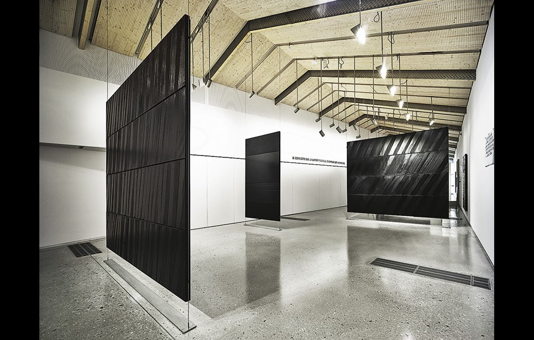
In the first volume, visitors get to learn more about the university’s various research projects, while the second is set aside for innovative and experimental installations and exhibitions. The third volume houses a café and a sound archive with thousands of recordings made over the history of the Montreux Jazz Festival, which began in 1967 and has hosted artists such as Aretha Franklin, Ray Charles, Lenny Kravitz and David Bowie.
“Artlab is intended to be a hub for cultural and artistic activities, while the spaces between the volumes direct the daily flow of lecturers and students through the site,” sums up Javier Ruiz Villar, who is originally from Barcelona, but has lived in Tokyo since 2004.
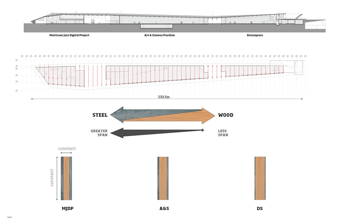
It is probably the beautiful long roof that first stops visitors in their tracks. Equating to almost two and a half football pitches, the length itself is a strong statement. The span, which gradually expands from five metres at the north end to 16 metres at the south, is another eye-opener.
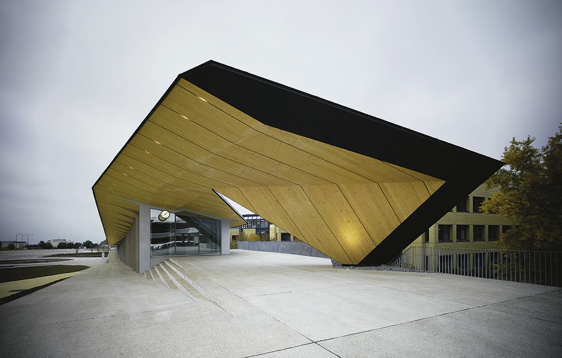
And then there is the fact that the roof height changes according to the function below. However, Javier Villar Ruiz says this was mainly for economic rather than aesthetic reasons, as a way to keep to the budget by not building more than was necessary. The result is a roof where sun and shade constantly change the look of the slates, with the north end of the roof then tilted onto its side to reveal the light and welcoming underside. This makes for a strong contrast with the broad end at the south with its sharp, closed form.
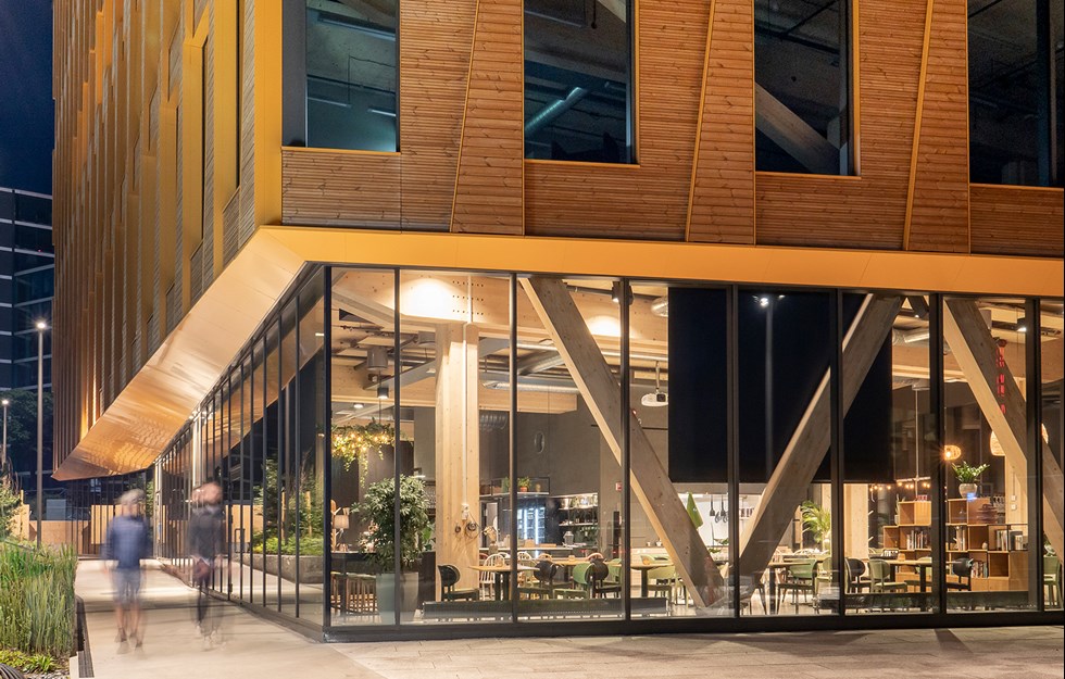
At night the building is tastefully lit, and in the day it sits comfortably with the rest of the built environment, without obscuring the views of Lake Geneva. The glulam and façade cladding are made of locally sourced larch.
“Wood is an important and sympathetic material that we enjoy working with, due to its appearance and acoustic properties,” says Javier Villar Ruiz, adding that it also helps to establish a pleasant indoor climate.
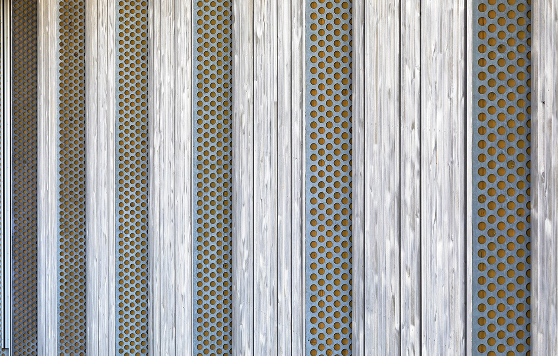
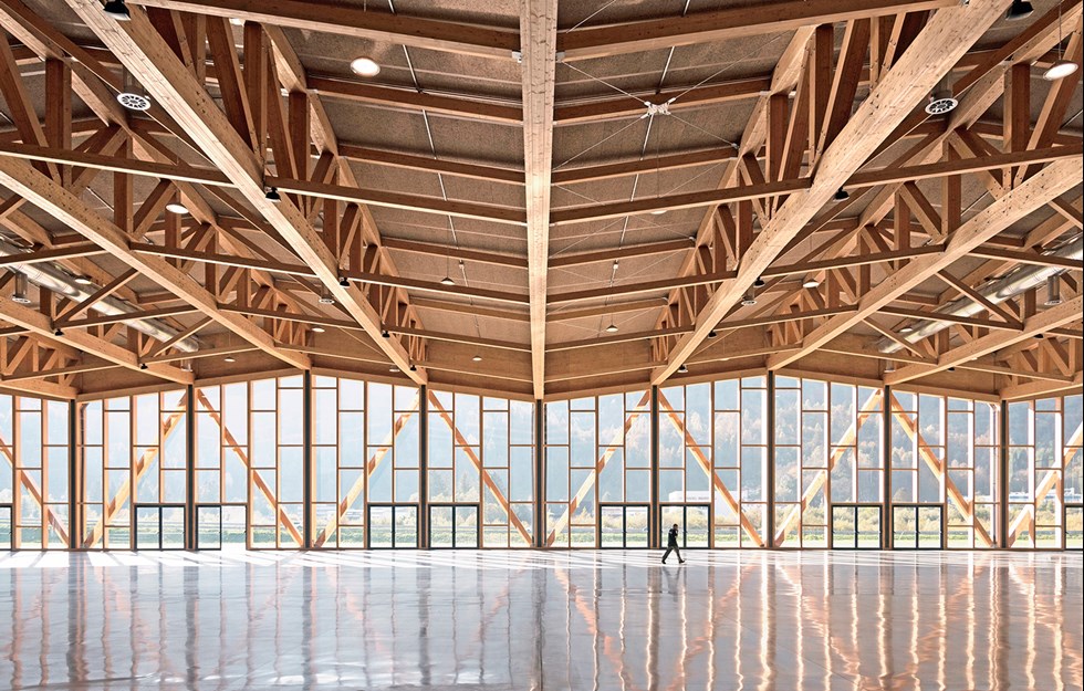
Since all the spans have different dimensions, a new technical solution was found for the design, with prefabricated posts and beams that have a core of wood covered with steel panels that are perforated in order not to lose the feel of the wood. The proportions of each material are then adapted to the width of the roof. The broader the span, the more steel is used. And vice versa. This means that the dimensions of the posts and beams around the 57 voids, always set at a 3.8 metre centre spacing from each other, can be exactly the same, irrespective of the span length.
The same wood and steel design is also used for most of the mezzanine floors that make up part of the project.
“It’s like a kit, easy to make and erect. There is no reason not to use wood. It’s always good and it’s cheaper than other materials,” says Javier Villar Ruiz.
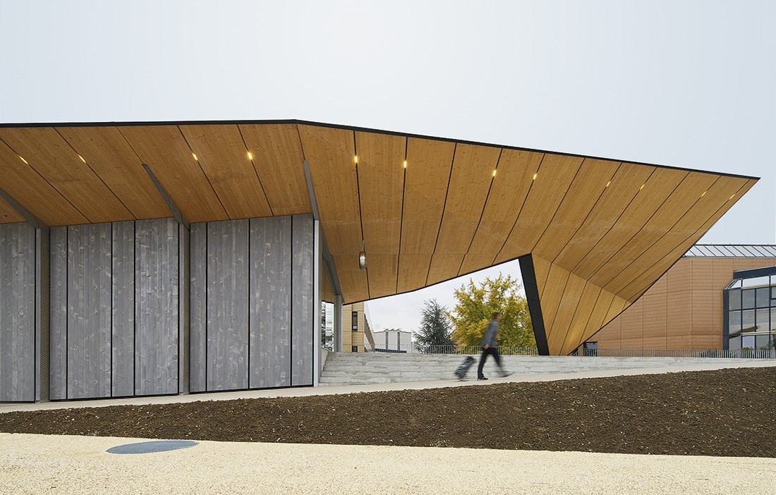
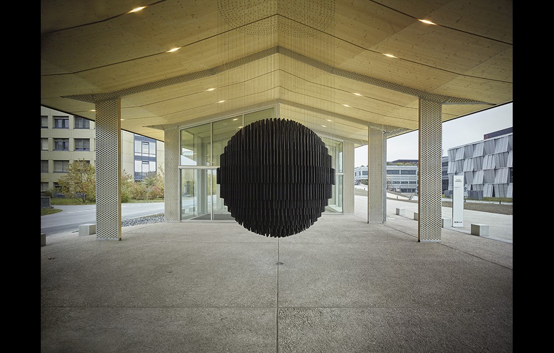
The roof has generous eaves reaching out over the wooden veranda that forms part of the walkway between the university’s different areas. Thousands of people can go about their business undercover, while inquisitive passers-by can peer through the large windows that contribute to the airy impression of the three pavilions.
The façade is finished with larch exterior cladding. But since the architects wanted to avoid the cladding becoming patchy with age, it has been treated to look greyed from the beginning. The homogeneous pale grey shade combines with the dark roof to give the whole building a subtle presence, despite its considerable length.
“The colour is meant to harmonise with the surrounding buildings and with the usually quite grey weather in Lausanne,” says Javier Villar Ruiz.
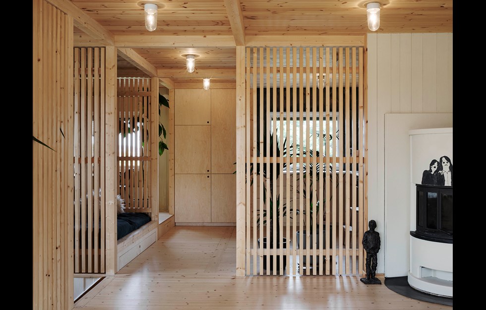
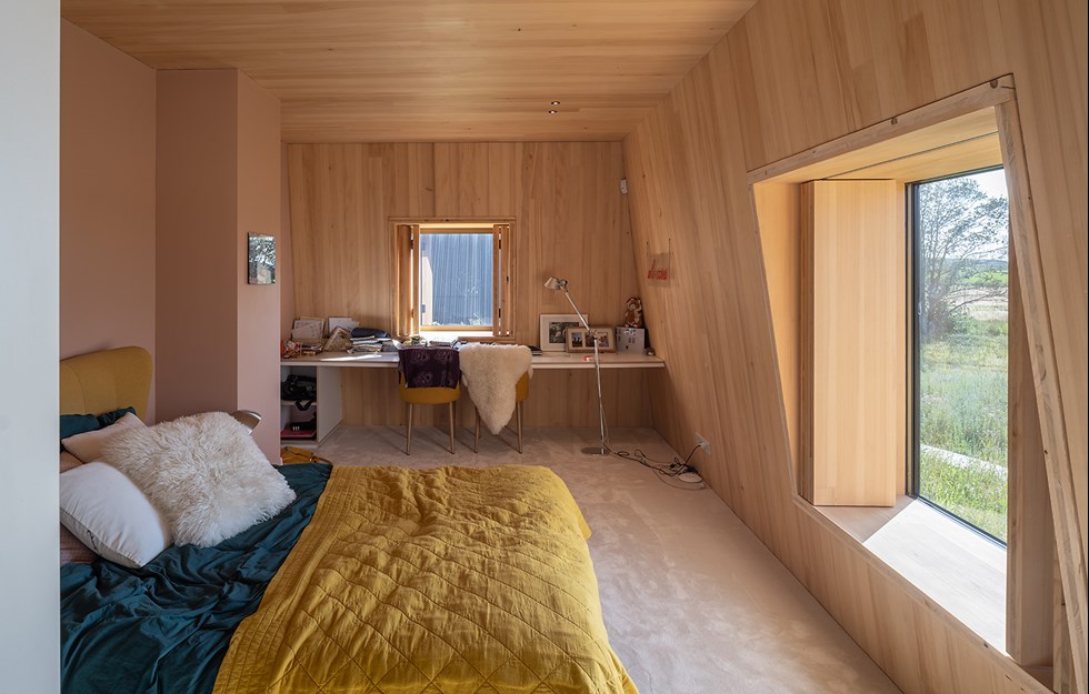
When you get closer to the body of the building however, under the shelter of the eaves, the underside of the roof is a warm natural colour. Internally, wood is again a constant presence in both the walls and the ceilings.
Javier Villar Ruiz claims that Artlab is not a large building, with its floorspace of little more than 3,300 square metres. But, he stresses, it is a building that has a large presence, both visually and as part of the university’s future development.
“An exciting project that makes an impression and lends character to the site.”
Read more at Artlab and Kengo Kuma
Text Mats Wigardt

