Monomateriality from floor to ceiling The city of Baiona lies in the region of Galicia, Spain’s most westerly outpost. Here the firm Murado & Elvira Architects has breathed new life into the old Sancti Spiritus hospital, which dates back to the late 17th century. The library and the city’s historical archive have now moved in, to the joy of both residents and the many tourists who walk by on the adjacent pilgrimage route El Camino de Santiago.
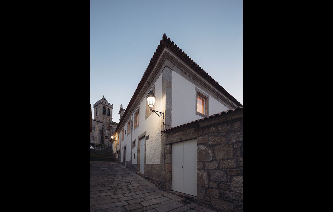
The two-storey building is embedded in the historical centre of Baiona. Despite being listed as a ‘Bien de Interés Cultural’ (BIC), it has suffered years of careless, not to say reckless, renovations, particularly during the 1970s, when the original interior was practically eradicated. The brief for the refit and complete renovation was therefore clear when Murado & Elvira Architects won the assignment in 2010. The character and the exterior should be preserved, with the majority of the work focused on the interior instead.
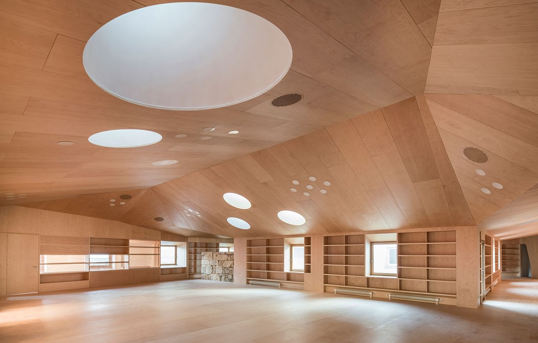
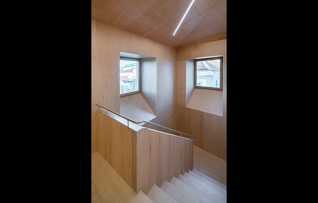
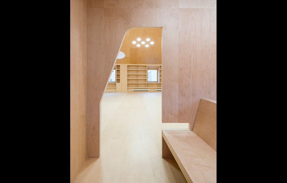
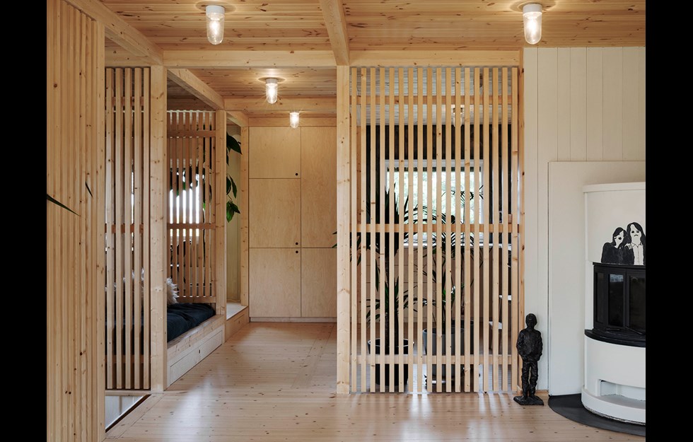
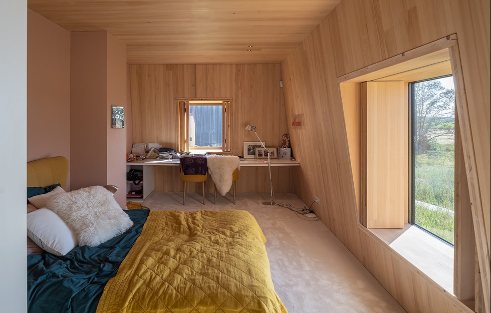
The architects wanted to explore the idea of a kind of monomateriality, which features in many of Baiona’s historical buildings, where walls, floors and even the ceiling are made of stone. They have embraced this notion for the interior of the library, where the rooms’ walls, floors and ceilings are clad in certified maple veneer, fitted to a timber frame. In contrast to most other woods, the sapwood is used for maple instead of the heartwood. This gives an almost bone-white colour, sometimes with a hint of red or warm gold.
“With a renovation project like this, you can be sure that you’ll hit on surprises and unexpected problems. Luckily, wood is a forgiving material that is easy to work with and make changes to on site. Wood is also a material that touches people, and in our case offers an exciting contrast with the existing stone exterior,” says architect Clara Murado.
The windows and doors are made from eucalyptus, a tree that has been grown locally in Galicia since the 1920s. It is a homogeneous, hard and durable wood that is able to handle weather, wind and rapid temperature changes.
“The Italian renaissance artist Antonello de Messina and his painting ‘St Jerome in his study’ from 1474 provided inspiration. The image shows the saint sitting in a workspace with no walls or ceiling – a room that is part of a larger context and whose wooden furnishings are part of the fixed interior.
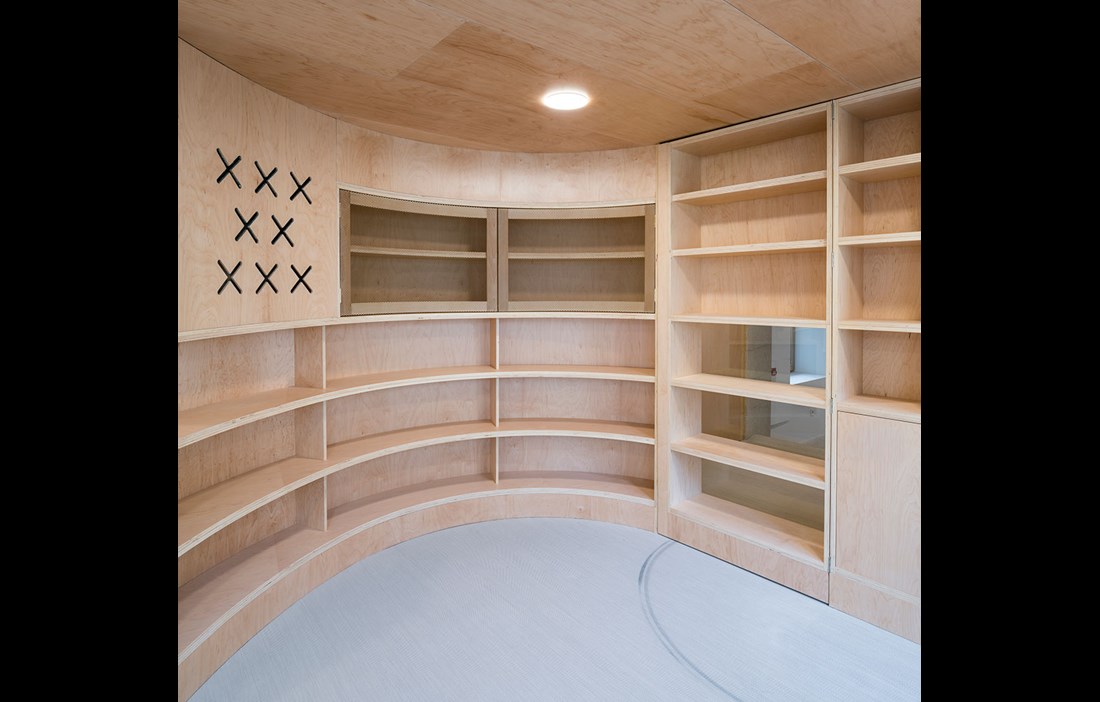
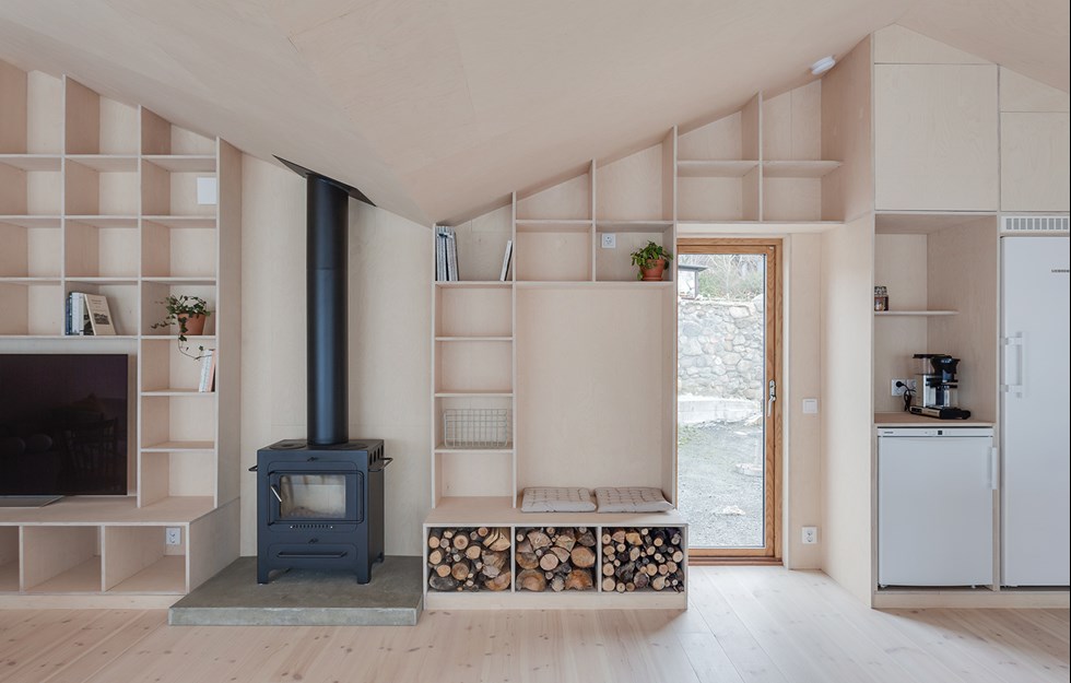
The harmonious monomateriality of the interior reaches from floor to ceiling, via the curving, multifunctional walls. These have been transformed into bookshelves and peaceful alcoves that provide a little privacy in the otherwise very open rooms. Similar alcoves – parladoiros in Galician – are common in the region’s Medieval architecture.
“We wanted to draw out the visitors’ curiosity and help them to take in the building little by little. We’ve also tried to create a playful, welcoming and tranquil atmosphere, as well as a sense of entering another world, with its own logic. Like when you read a book and you get completely absorbed in the story,” says Clara Murado.
when the forest moves in With its long religious history, it is no surprise that the city of Braga in north-western Portugal is full of churches. Founded by the Romans, the city is one of the country’s three archdioceses. Capela Imaculada is the church attached to the private boarding school for boys, Seminário de Nossa Senhora da Conceição, and in recent years it has undergone a major redesign under the leadership of Cerejeira Fontes Architects.
Capela Imaculada was built in the 1940s using stone that probably dates back to a much older church that once stood on the site. Before the refit, the building bore the scars of the tough post-war period. The place of worship was harsh and lacking in decoration, radiating cold rather than warmth. In addition, the acoustics were terrible.
In order to create a church that was both more functional and more beautiful, the architects decided to update the whole interior. The ceiling and floor were removed and only the solid and attractive stone walls were retained.
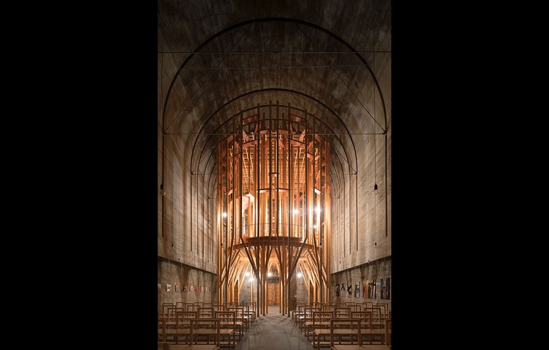
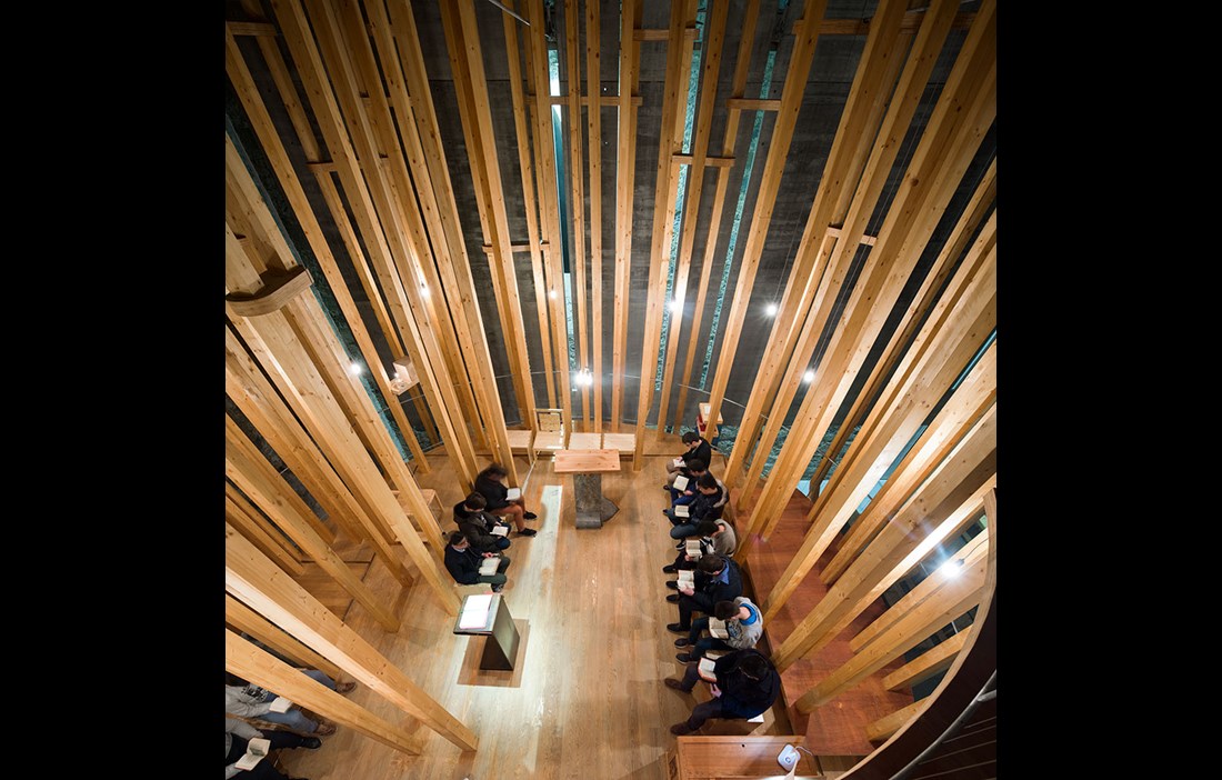
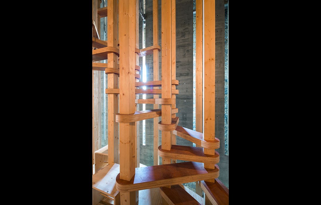
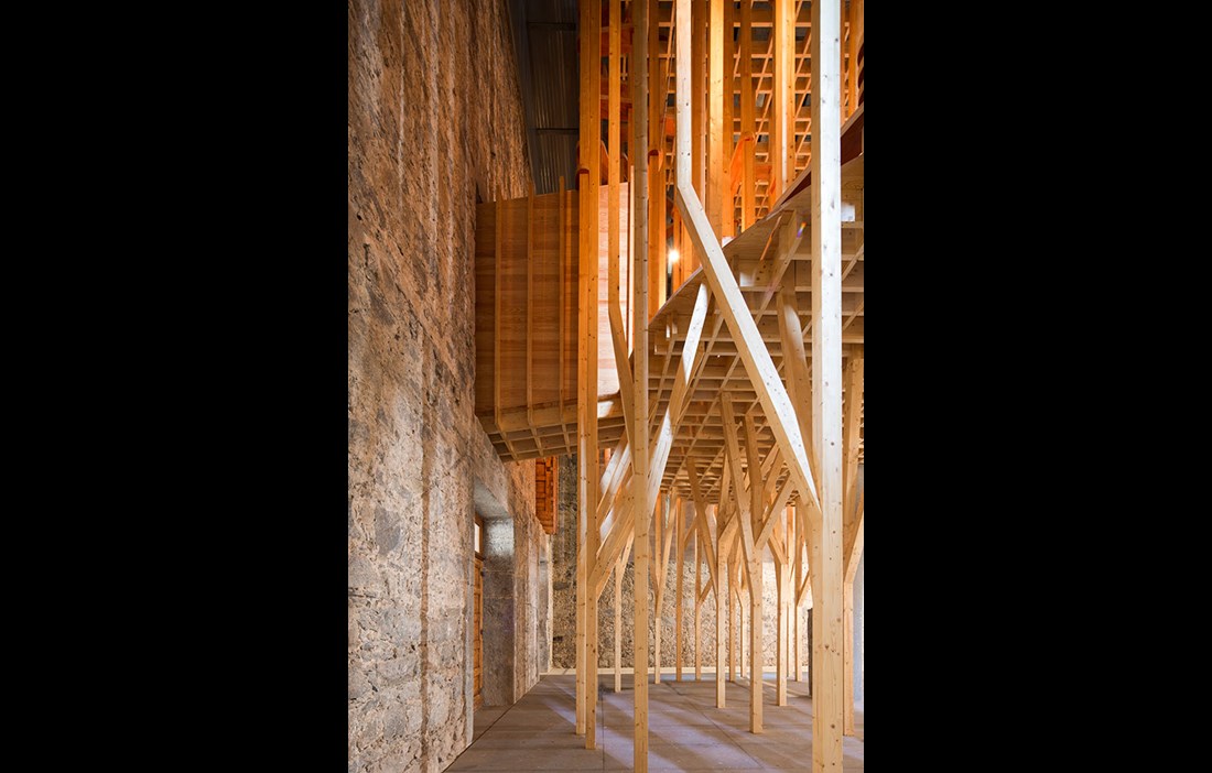
The chapel Capela Cheia de Graça was then installed by the entrance at the back of the church. This room within a room is a structure of ingeniously jointed glulam posts in spruce that rise up from floor to ceiling. The posts that support the actual chapel are almost like a forest glade that visitors have to pass through to enter the church. The chapel has no closed walls, leaving it open to the rest of the interior space, and it is accessed via a beautifully sculpted wooden staircase. The furnishings comprise benches and an altar in wood that rests on a pedestal of hewn granite.
“The sense of walking between the tree trunks is to be seen as both a pleasant transition and a filter between the profane and the sacred space,” says António Jorge Fontes, who runs Cerejeira Fontes Architects together with his brother André Fontes and the sculptor Asbjörn Andresen.
The chapel sits beneath a 12 cm thick concrete arch that defies its own materiality by appearing to float freely between the wooden structure and the stone walls of the church. The arch is held in place by a number of galvanised steel ties that stretch from wall to wall. Slits in the arch filter the sunlight and offer momentary contact with the world outside, while at the same time the enclosed feel encourages visitors to turn their gaze inwards. The lighting comprises around a hundred LED lamps that hang from the ceiling. The arch helps to give the church new and much better acoustics, an interesting and attractive light and a sense of space. The place of worship is simple and minimalistic, with restrained decoration.
“Our aim with Capela Cheia de Graça was to enable a dialogue between the individual and the divine. Wood is associated with warmth and humanity. It creates a homely atmosphere and makes a calm and harmonious impression. The stone exterior of the church has different qualities. It is a heavy, reassuring material that, just like wood, represents constancy,” says António Jorge Fontes.
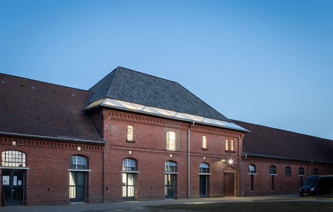
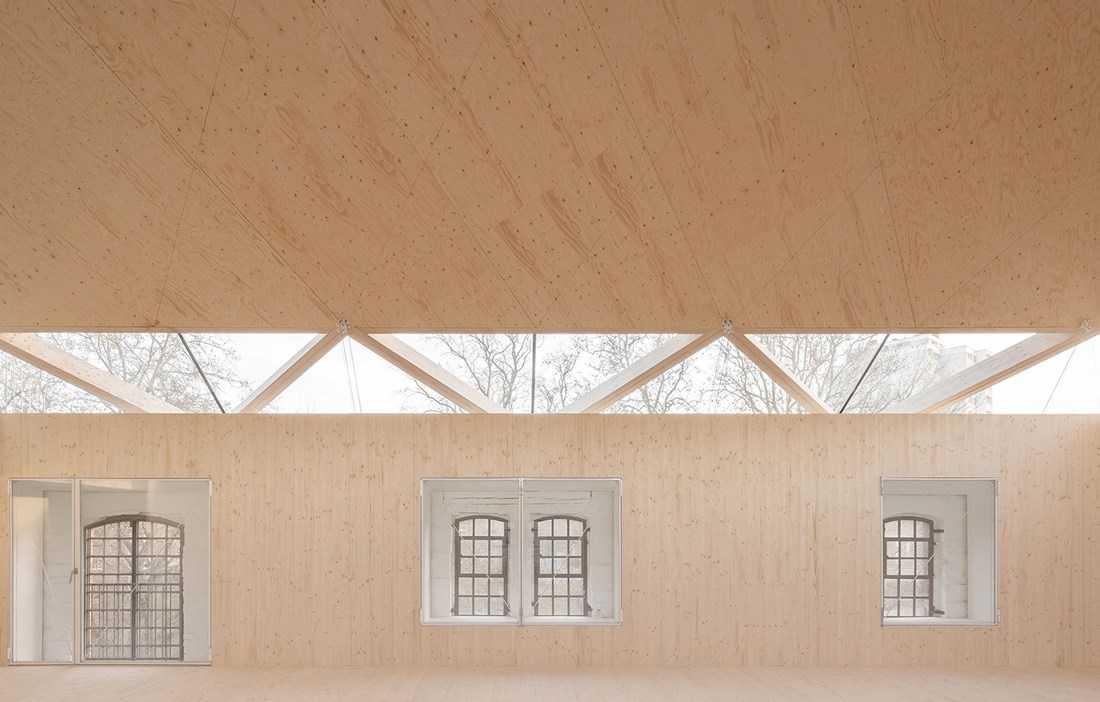
opened up for creativity Externally there is hardly a trace of the redevelopment work that was carried out up until April this year at the University of Fine Arts in the northern German city of Münster. Andreas Schüring Architecten worked with Bühler & Bühler Architects over the winter to create two new art studios bathed in natural light. The purpose of the airy studios in this listed stable block from the 19th century is to provide a space for the students’ often expansive creativity, while also meeting the requirements for natural daylight.
A new internal structure has been achieved by replacing the existing, ageing roof with a new one. Since the building is listed, the new hipped roof had to follow the same geometry as the previous one. Taking this on board, the architects came up with an ingenious solution that created a new source of light by ‘lifting the lid’ and opening up a gap in the lower part of the roof structure.
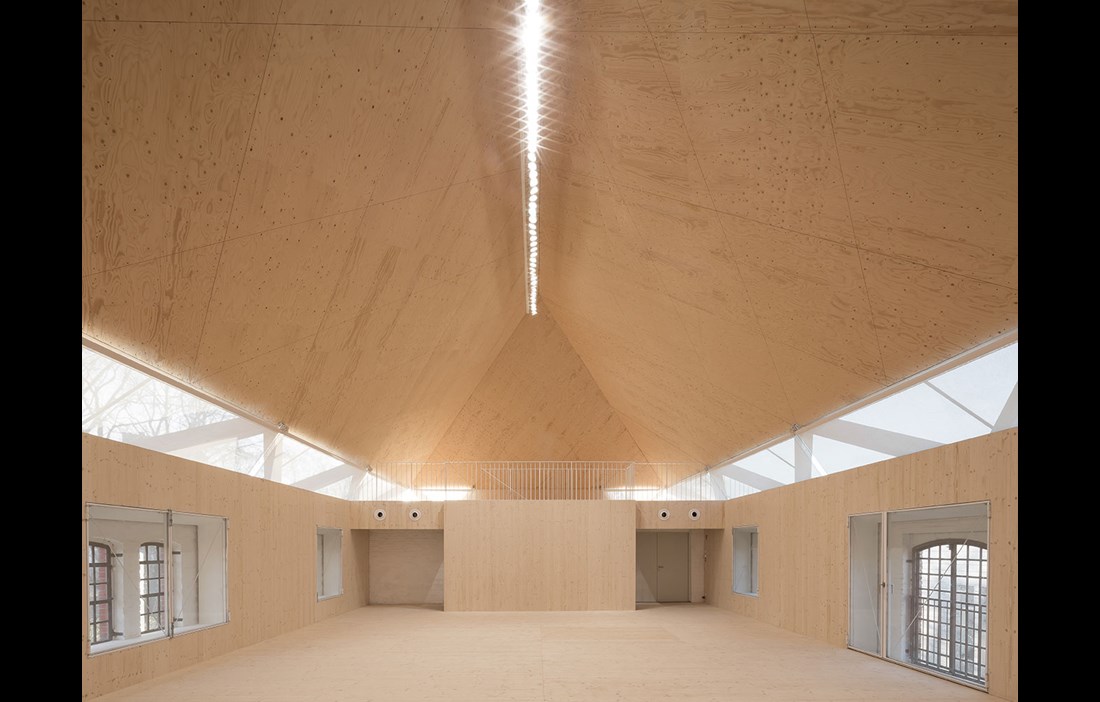
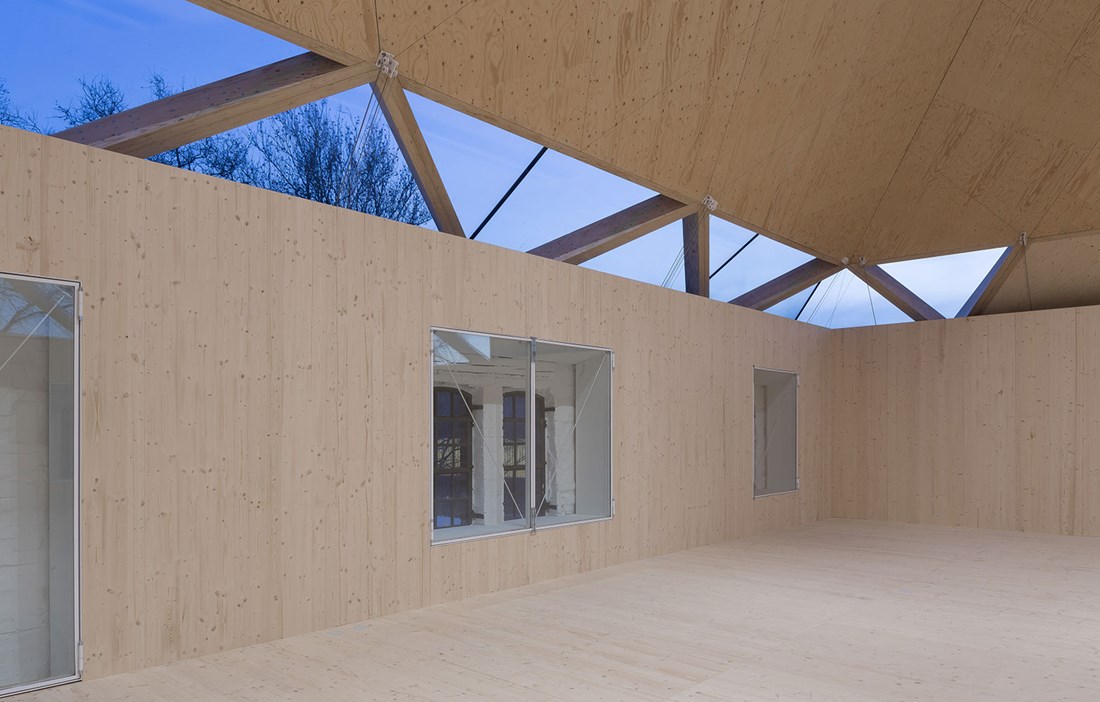
The prefabricated roof elements comprise beams and panels in Kerto (laminated veneer lumber – LVL). The engineered wood product comprises 3 mm thick spruce rotary-cut veneers that are glued together to create a large format panel. The panel can then be cut to the right length and sawn into beams, joists or smaller panels in the required sizes. The roof elements are supported by an open glulam structure that celebrates the load bearing frame. On top of that are the glazed units. Almost invisible from the outside, this change to the exterior let’s daylight flood into both of the spacious studios. The new flat rooflights admit a soft light that spreads evenly around the whole room.
“The challenge was that the redevelopment needed to be completed during term time, without causing too much disruption to operations at the University of Fine Arts. This informed our choice of large prefabricated wooden elements, which enabled the new roof to be assembled in just a few days,” says Andreas Schüring.
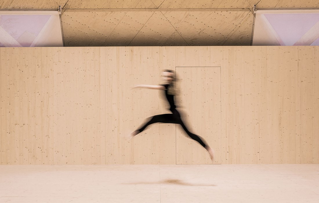
Internally, the thick brick walls have been lined with 3 metre high plywood panels in spruce. The panels, which also cover the floor, are set back from the external walls and have openings to accommodate the existing windows. One of the requirements from the University of Fine Arts was that the space should be kept free from distracting elements and technical installations, to give the space as clean and pure a feel as possible. The ventilation has therefore been concealed in the gap between the outer and inner walls.
“The subtle interior in pale, untreated spruce provides a strong contrast with the brick façade. Inside the studios, you have a sense of the roof almost floating, which reinforces the light and airy atmosphere,” says Andreas Schüring.
One advantage of the plywood panels is that they are both simple and cheap to replace – something that is likely to be needed on a regular basis as the students passionately splash paint around.
“On this project, we’ve combined industrial construction with on-site carpentry. That’s perhaps what I like most about wood. The fact that the material allows for different ways of working. This makes it easier to bring our ideas to life,” concludes Andreas Schüring.
text Katarina Brandt

