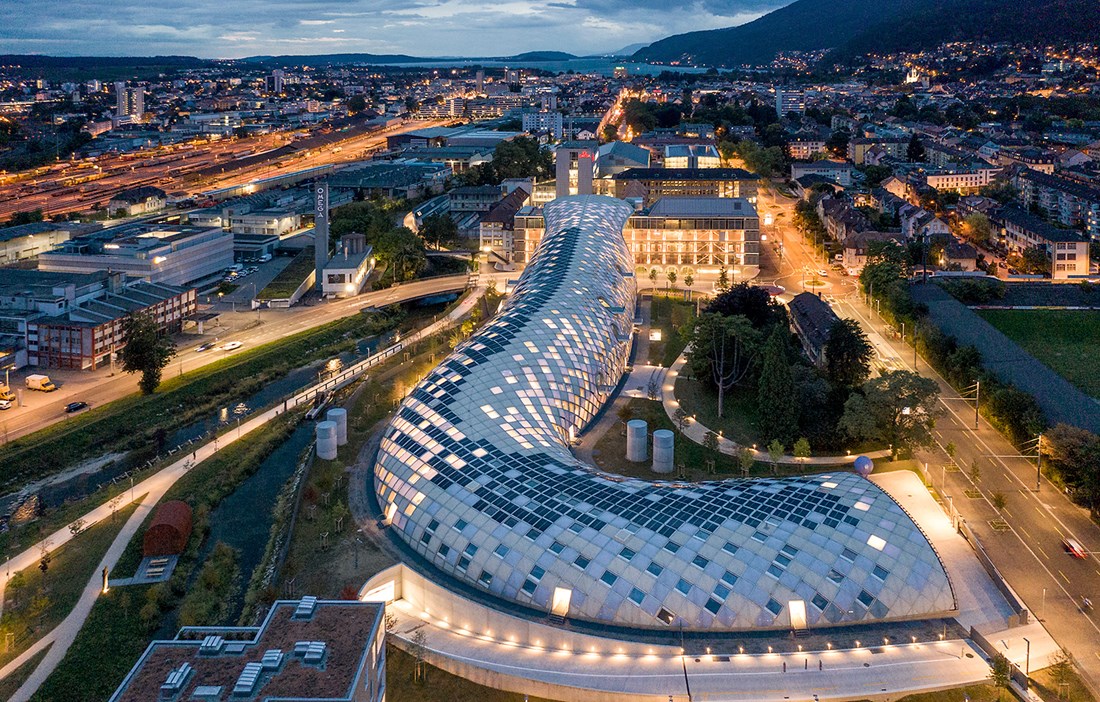
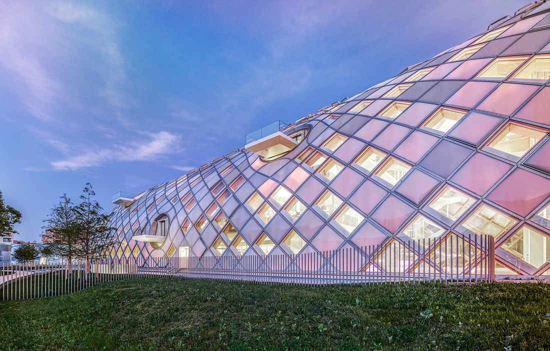
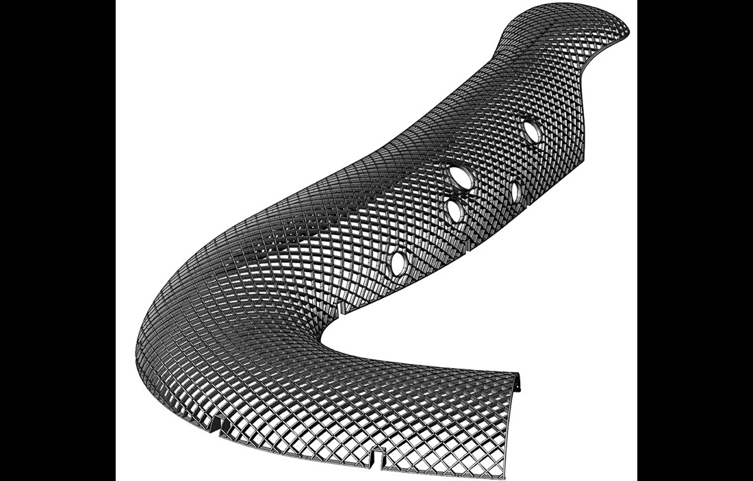
There is much that is unique about Swatch’s new headquarters in Biel, Switzerland. The main one, of course, is the architecture. The 240 metre-long building is like a glistening snake winding its way along the Schüss river. Architect Shigeru Ban, however, has a more pragmatic description.
“The form of the building is a natural consequence of the L-shaped site. The bottom of the L is the building’s entrance, and the other side is used as a loading bay, he explains.
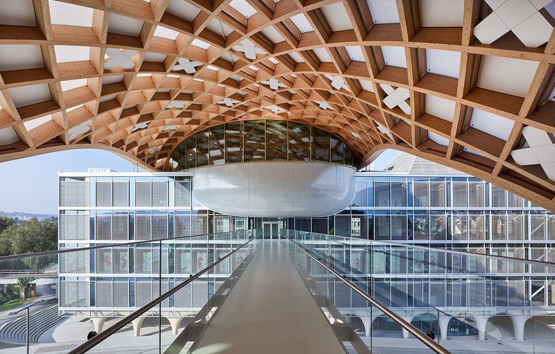
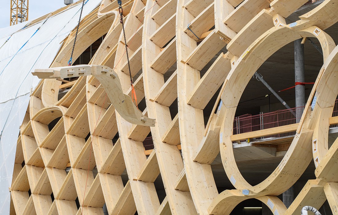
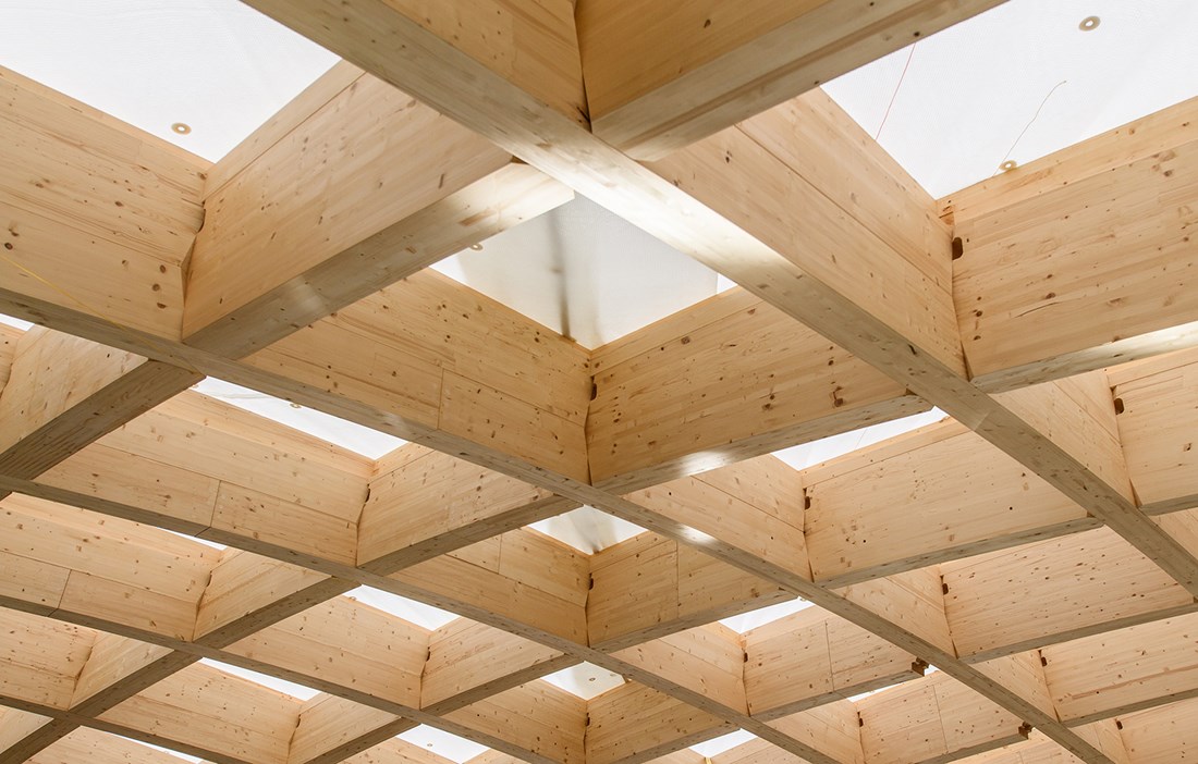
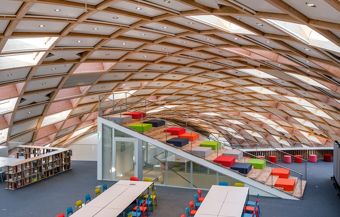
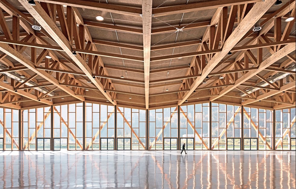
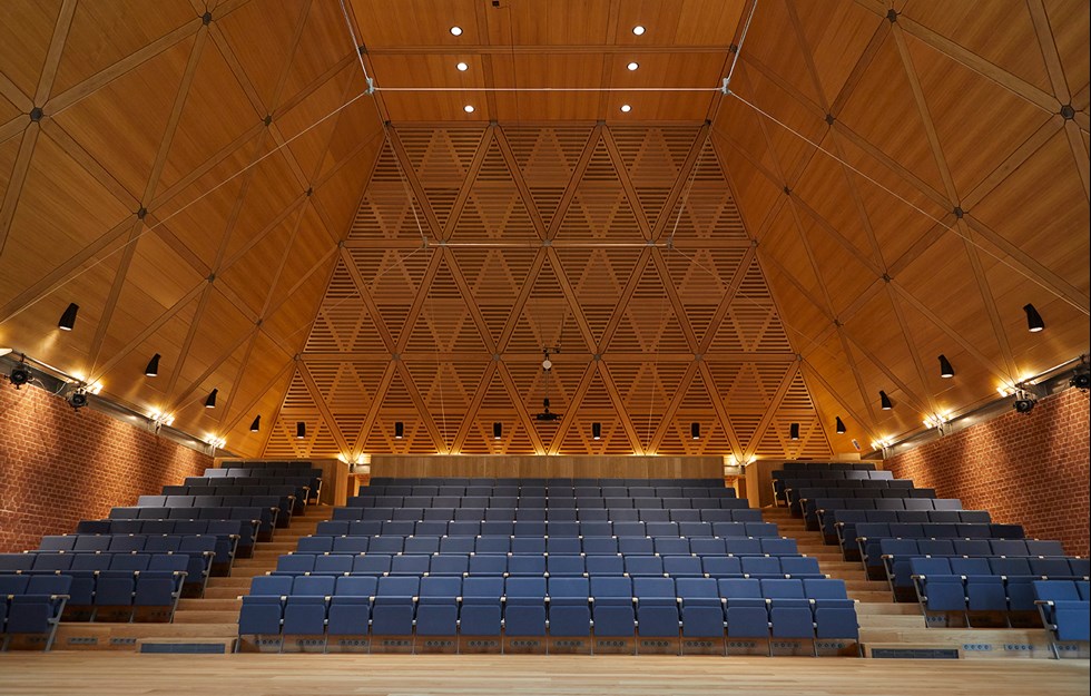
The curved wooden structure, with its grid shell frame, provides the façade, roof and load-bearing carcass. It is made up of 4,600 wooden beams, of which no two are the same. The raw material is Swiss spruce that has been glued together into three different types of beam: straight, single-curved and double-curved, depending on how much load they need to take – with the double-curved beams used in the places under the greatest loads.
“If you stand on the top and look down, you’ll see that the grid has a primary direction and a secondary direction. Each part of the grid comprises two layers that flow in separate directions. The grid line in the primary direction has to take the greatest loads, but the secondary line is also load-bearing,” says Jan Hempel, project manager and head of 3D modelling at Blumer-Lehmann, which has been responsible for the wooden structure on the project.
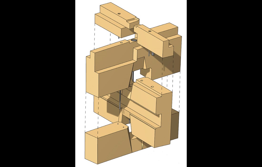
The longest grid line, comprising a row of connected elements, is 120 metres, and the longest individual element is 30 metres. The nodes that repeat every 2–3 metres contain no steel components, instead using ingenuously milled wooden components that lock each other into place. Complex 3D models and parametric design have been used to achieve the required level of precision. All the parts were then cut in advanced CNC machines with extremely high accuracy.
“We’ve worked to a tolerance of 0.5–1 millimetre for the individual pieces and 0.1 millimetres in the nodes,” says Jan Hempel.
The build was divided up into 13 sections and work began around the middle of the structure. This established an efficient building process that allowed for construction work to continue in two directions at the same time. As soon as the ground-level elements were anchored into place, it was also possible to work upwards from each side, eventually meeting at the top.
“It was a fantastic feeling on the day that we assembled the final parts of the grid shell and saw that everything fitted exactly as we had calculated,” adds Jan.
Since every part of the design was unique, one of the challenges was to ensure the right part was in the right place at the right time. It wasn’t possible to do the milling in advance and store the large number of curved elements measuring up to 13 metres in length. The elements were therefore sawn and delivered to the construction site in the exact order they were going to be used.
“The other challenge was that all the technical installations, such as the ventilation ducts and power cables, had to be run within the grid shell, instead of the usual way of going between the floors. This also meant that everything had to be meticulously planned in advance,” says Jan.
With its 18 brands, the Swatch Group is a world leader in watches. The new headquarters is one of three units in a larger newbuild project and gathers all the group’s brands in one place. In addition to the Swatch headquarters, the project comprises Cité du Temps, which houses a museum for Omega and Swatch, plus the Omega factory, with its production and warehousing space.
“All the buildings are made of wood and designed by Shigeru Ban, with us taking care of the structural engineering,” relates Jan Hempel.
The Omega factory is a little further away, while Cité du Temps and the Swatch building are directly linked to each other. The Swatch building’s grid shell continues over the road that separates the two buildings and rests on the roof of Cité du Temps – from above it looks like a snake taking a bite out of the other building. The two buildings are also connected via a glazed pedestrian bridge.
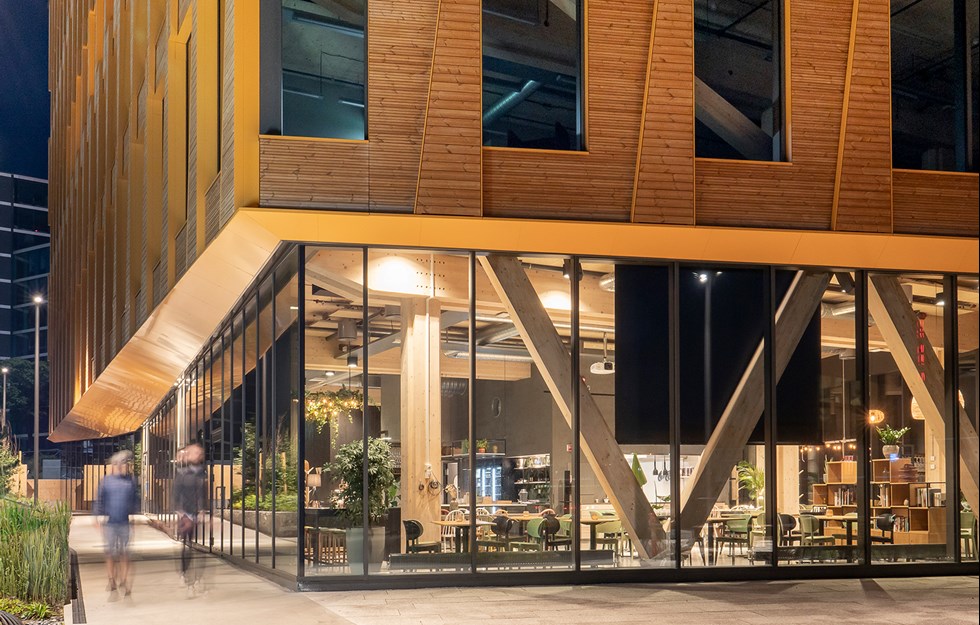
Inside, the Swatch headquarters contains 25,000 square metres of office space, spread over four floors. In addition to offices and storage, there are large conference rooms, a public cafeteria on the ground floor, five large olive trees stretching over two floors and a reading and brainstorming area on the second floor, shaped like a staircase to nowhere.
The building’s grid shell design is repeated in the flat glazed façade at the entrance. It begins at a height of 5.5 metres and reaches up to 27 metres, before connecting with the roof elements. On the exterior, the roof is clad in several different materials that vary between the different squares of the grid – or scales on the snake’s skin, if you will. Some form transparent windows, while others are opaque.
Like on the other two buildings in the project, large swathes of the roof are solar panels. On the Swatch building, they cover 1,770 of the full 11,000 square-metre roof area. The panels are expected to generate a little over 213 megawatt-hours of electricity each year, equivalent to the consumption of 61 Swiss households.
Clever use of groundwater to heat and cool the building, along with efficient systems for ventilation and lighting, contributes towards high energy efficiency and low carbon emissions. The basement also contains bike parking, bikes for loan and charging stations for electric bikes.
But Shigeru Ban, who has offices in Paris and Tokyo, prefers to talk about the sense in making good use of resources, rather than using the term sustainability.
“I have no interest in sustainability. I simply refuse to waste resources. Sustainability has become a buzzword. I think we overuse it, but have forgotten what it means. That’s why I never use it,” he says.
text Sara Bergqvist

